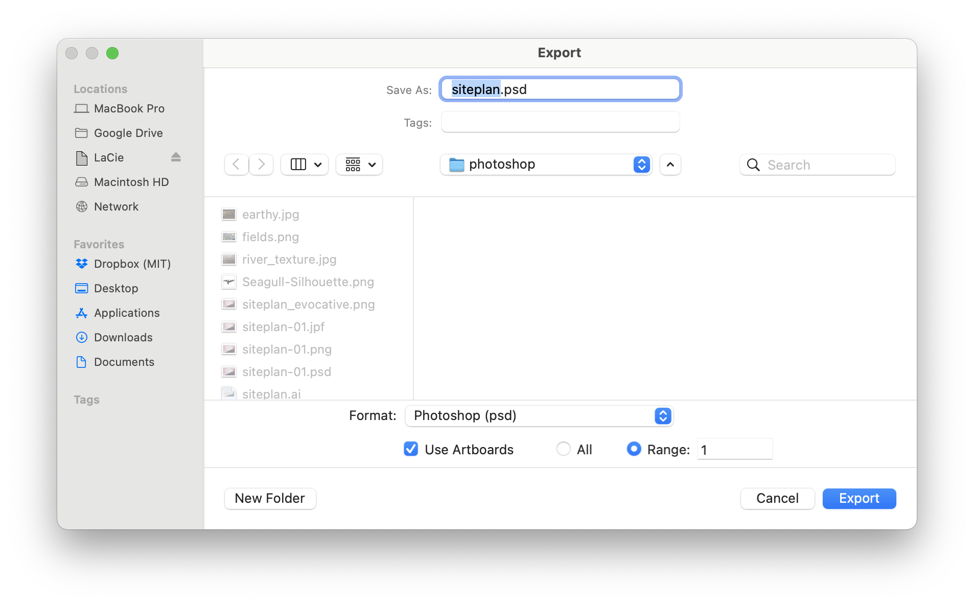
We first need to export our site plane from Illustrator in a way that
will give us access to all of our layer information once we bring it
into Photoshop. In Illustrator, navigate to
File > Export As... Select ‘Photoshop (PSD)’ as your
destination format and ensure that “Use Artboards” is checked. (This
will crop the output to the edge of your artboard.)
Export your site plan as a
PSD.
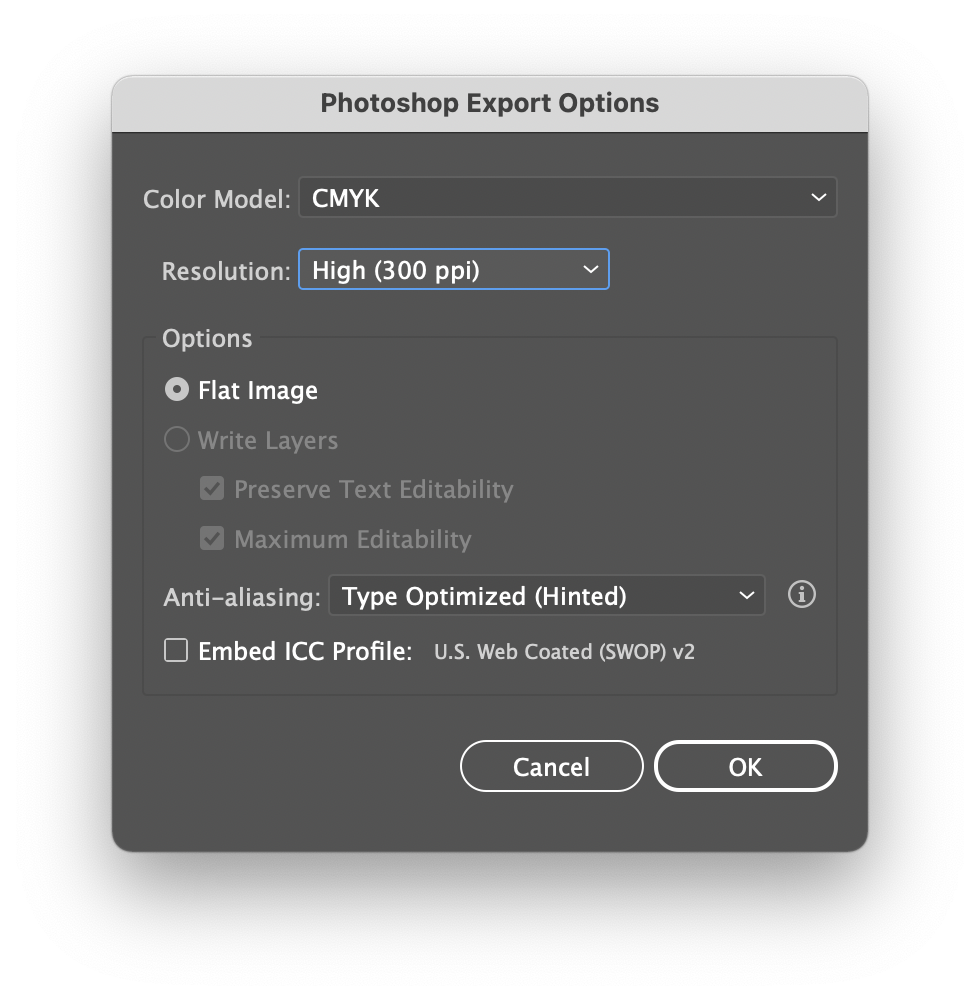
In the following screen, choose High Resolution (300 ppi—pixels per
inch) and “Write Layers” with “Maximum Editability”. With these
settings, we’ll preserve layers, transparency settings, etc. which
leaves all of these things editable once we’re in Photoshop.
Write layers with maximum
editability.
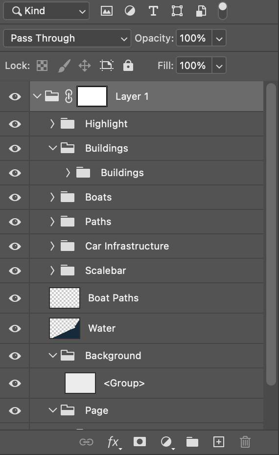
Now, open the resulting file in Photoshop. You should see… well, what
you saw in Illustrator. If you look at the layers, you’ll see your
layers, intact and modifiable.
Photoshop layers pane.
Use Foreground Objects to
Add Depth
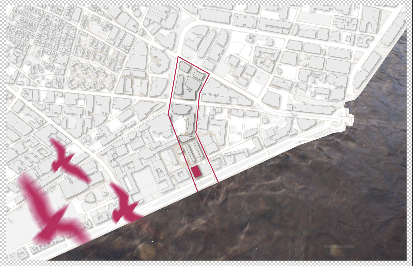
First, we’ll add a flock of seagulls flying close to the implied
“camera” to add depth and motion to the image. I’ve provided an image
you can use (seagull.png). I downloaded this image from freesvg.org—the image is published by OpenClipart
and is in the public domain, meaning there are no restrictions on its
use.
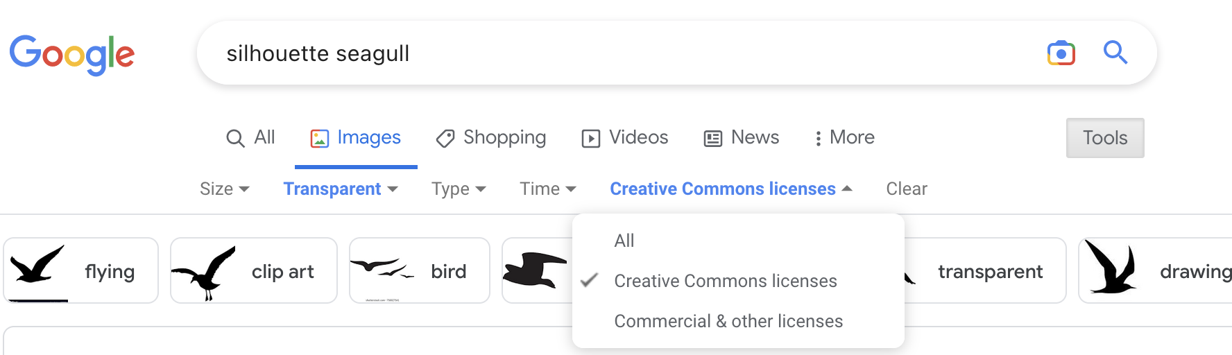
A quick note on licensing! Architects and urban designers are
somewhat (ahem) infamous for simply pulling anything a Google search
yields into their drawings. There’s a problem with this—it’s often
illegal. Google images provides some tools to mitigate against this and
I advise you use them. Namely, when you search on Google images, click
“Tools” to the right; note that it lets you select “Usage Rights”—if you
search for “Creative Commons licenses,” Google will restrict results
that won’t give you legal problems, as long as you’re not making
commercial use of the image.
Google Image search with license
restrictions in place.
Note that you can also select “Transparent” from the “color”
dropdown. This will make your life far easier as well! It’ll save you a
lot of time spent cutting images out from their backgrounds.
Drag-and-drop the image into your canvas and press enter to place it.
You can drag the image and transform it (shrink/rotate/skew it) after
the fact. Press cmd/ctrl-T to transform it. We want it reasonably big,
but not enourmous. Place it in the bottom left corner.
While this new layer is select, press cmd/ctrl-J to duplicate it.
(You won’t see anything because it’s directly on top of your other
layer. This time, though, we’re going to use a quick trick to make it
less obvious that we’re using the same image over again. Navigate to
Edit > Transform > Flip Horizontal. Finally, make the
bird a slightly different size to imply that it’s flying higher or lower
than the other.
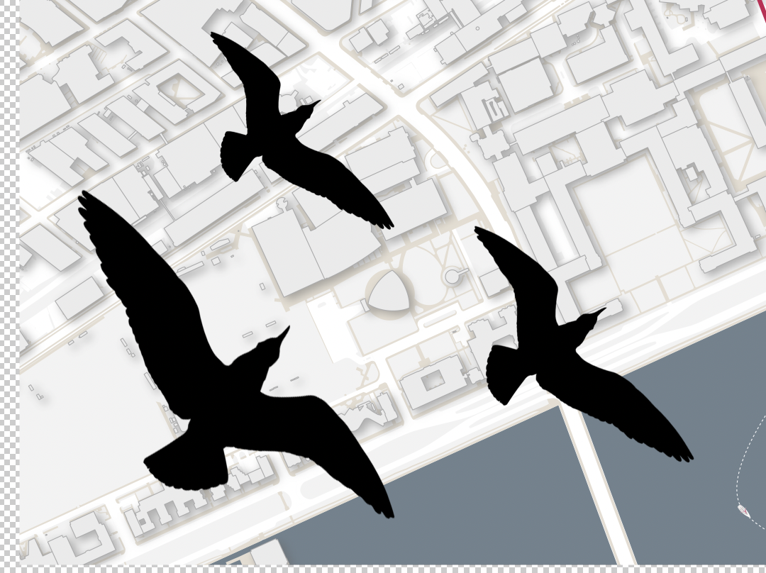
Do all of this one or two more times to create a flock of seagulls.
Select all three layers in the layer pane and group them. (See the
little folder at the bottom of the layer pane?) Good layer management
will help you a lot in the future!
A flock of seagulls!
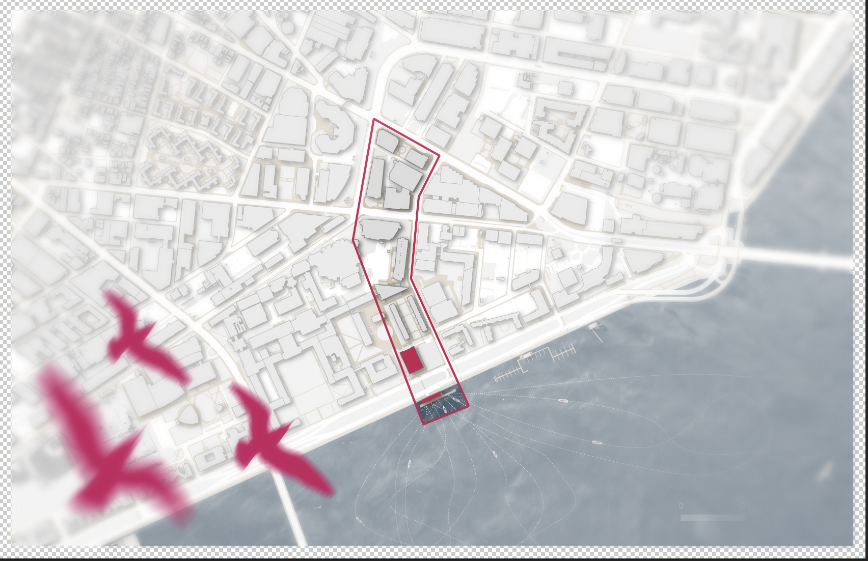
Birds Fly: Suggesting Motion!
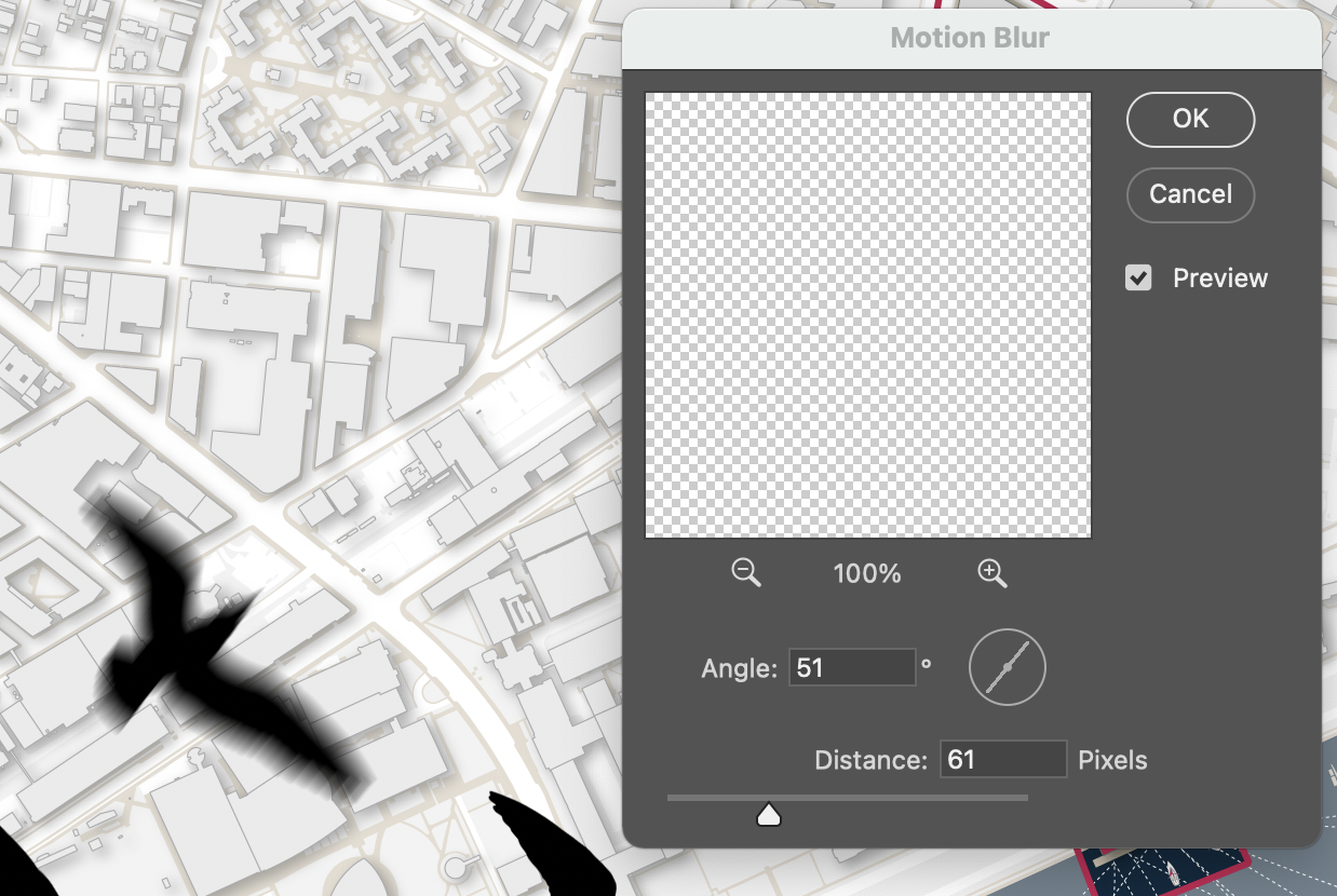
Now, select one of the seagull layers. We’re going to use a Motion
Blur filter to suggest motion! Filters are quick ways to both enhance
(and, TBH, ruin) your images. All things in moderation!
With the layer selected, navigate to
Filters > Blur > Motion Blur. Play with the angle and
the distance; angle changes the direction of implied motion, distance
changes the suggested speed. (Larger values = faster!) For this first
bird, let’s use an angle of 50 degrees and a distance of 60 pixels.
Motion blur.
Repeat using slightly different values for each bird. You should wind
up with something like the below.
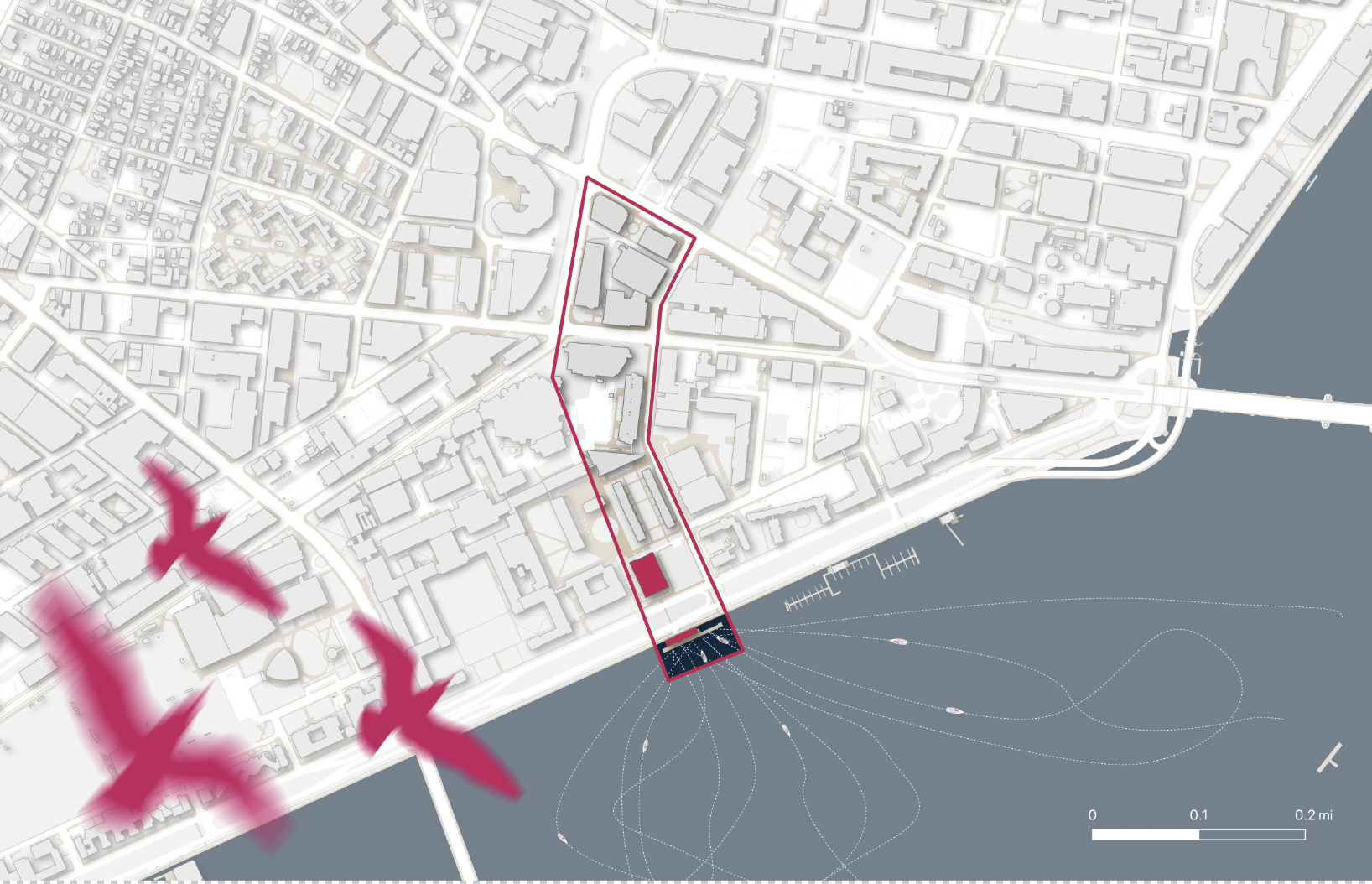
Finally, let’s ease away from naturalism—birds can be magenta,
right?! One of the things Photoshop allows us to do is to
non-destructively edit layer colors by using “Color Overlays.”
Right-click the seagull group and select “blending options.” In the
“Color Overlay” interface choose the color #C61E5E. Your
birds should now be a pleasing deep purple-red.
Color overlays.
Add Texture to the Water
In illustrator, we created a shape to indicate the extent of the
Charles River. But it’s currently very flat—no sense of texture or
motion. So let’s texturize it!
I’ve provided a water texture (river_texture.jpg) that
you can use. It’s from Flickr user Heath
Alseike. I found it using the same Google images trick I outlined
above. Drop it into your project and size it so that it covers the
entirety of the river.
Now, there are situations where you’d want to manually crop this. But
because we have a layer that indicates the extent we need, we can simply
use it to mask this water layer. Masks are like cookie-cutters…
if you could adjust which dough they cut after the fact. To create a
mask one the water layer, select that layer and click the rectangle with
the hole cut from it below the layers pane.
Nothing happens immediately; that’s because by default a mask is set
to show the entire layer. Let’s change that. Select the layer that
contains your water. Right-click it and choose “select pixels.” This is
a very fast way to select all “stuff” that’s in a given layer. Now,
control/command-c to copy it.
Open the mask by option-clicking (on macOS) or Alt-clicking (on a
PC). Your screen should turn white. Shift-command/ctrl-V to paste the
water extent. If you click any other layer, you’ll exit the map view and
see that… oops! You’re backwards. The image area excluding the
river is being displayed. No problem—return to the mask view, select all
using cmd/ctrl-A, and invert it (Image > Adjustments >
Invert).
River texture overlay.
That’s correct, but it’s a bit overwhelming. First, the color clashes
with ours. Make it grayscale! (Image > Adjustments >
Hue/Saturation and pull the Saturation slider all the way down). Better…
but still maybe a bit intense and covers up the nice water color we
chose.
Here we’ll introduce blending modes. With the river color
selected, play with different blending modes. I chose ‘screen’, but note
that each does something different with the relationship between the
water texture and the color below. The best way to learn how these
interact is to simply play, play, play!
Fields are Not Blank
Expanses
You might notice some conspicuously blank spaces on your site plan.
One of the most common things you’ll have to do is use either aerial
imagery or images of particular site elements to supplement the
extremely unadorned GIS geometry.
I’ve included an aerial image of the athletic fields on MIT’s west
campus. (Drawn from Google Earth.) Your task is to place this imagery
using the transform (cmd/ctrl-T) tool, and then to ease it into the site
plan by making judicious use of the eraser tool, the lasso for cutting
out unneeded components, and blending modes to make it sit more
unobtrusively.
Finishing with Blur and
Texture
If we’re happy with the site plan, there are all kinds of ways we can
make it really pop in the final stages. We’re going to use two fairly
common techniques for giving the image a focus and a textural
cohesion—blurring the image around the study area and subtly overlaying
a texture over the whole image.
First, select the whole image. Additionally, hide the scale bar - we
don’t want to blur or process that text. Now, copy everything below as a
flattened image using Edit > Copy Merged (or
shift-cmd/ctrl-C). Paste the results on top. While it looks the same as
the layered image, this top layer is a merged copy of the entire image
under it. We’ll now blur this entire layer using
Filter > Blur > Gaussian Blur. I used a radius of
18—larger values are blurrier, smaller are less blurry.
Now, add a mask to the layer and enter the mask view (again, option-
or alt-click). Select the gradient tool in the toolbar on the left and,
at the top of the screen, select radial gradient (the one that looks
like it’s emanating from the center). Click in the middle of your study
area and drag outwards. If it’s blurring in the wrong direction (i.e.,
your site is blurry but the surrounds are clear) simply click “Reverse”
in the top bar. Here, we enter the realm of the judgement call! What’s
too much? That’s up to you. You can also play with different blend modes
to make the blur interact with your other layers differently. I used a
multiply blend mode and wound up with something like this:
Blur effect.
As a last step, let’s ’add some texture to the whole thing. Be
careful here! Too much of this and your work will look extremely corny.
This is meant to be applied lightly.
With that caveat aside, drop in the earthy texture
(earthy.jpg) and desaturate it. This
is from Wikimedia Commons user Lionel Allorge. Play with different
blend modes and note what they do to your image. I used
screen. Now, SERIOUSLY tone down the opacity. I wound up at
about 25%. Importantly, clip around the edges if the texture is bleeding
off. (The fastest way to do this is often to merge-paste your image
again (without the blurred layer) and select all the area around the
image using the magic wand tool. Then, select your earthy layer and hit
backspace to delete it.
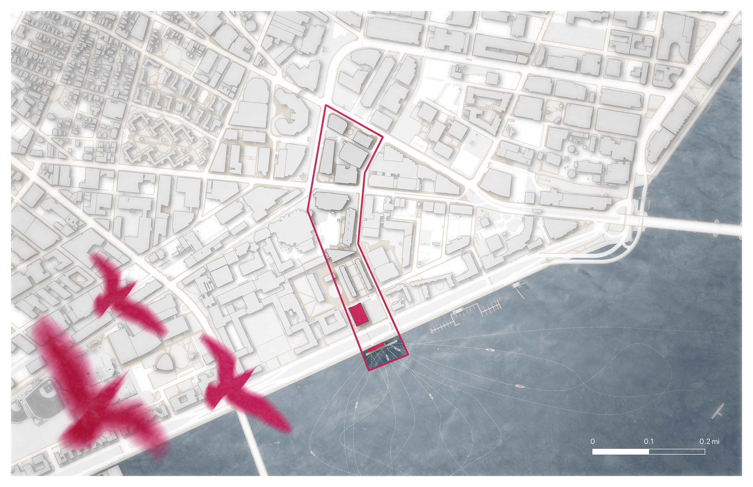
The image I wound up with looks like this:
A finished, fairly evocative site
plan.
As you can imagine, there’s a lot to play with here! Spend some time
doing so—drop in different textures, place some trees, make big changes
to the build landscape… as with all software, really the only way to get
better is to play.
