Site Plans in GIS and Illustrator

Eric Robsky Huntley, PhD (They/them)
- Lecturer in Urban Science and Planning
- ehuntley@mit.edu
Tutorial Information
- Module 2 in Design and Representation for Planners.
Methods
Tools
QGIS Preparation
Import Layers
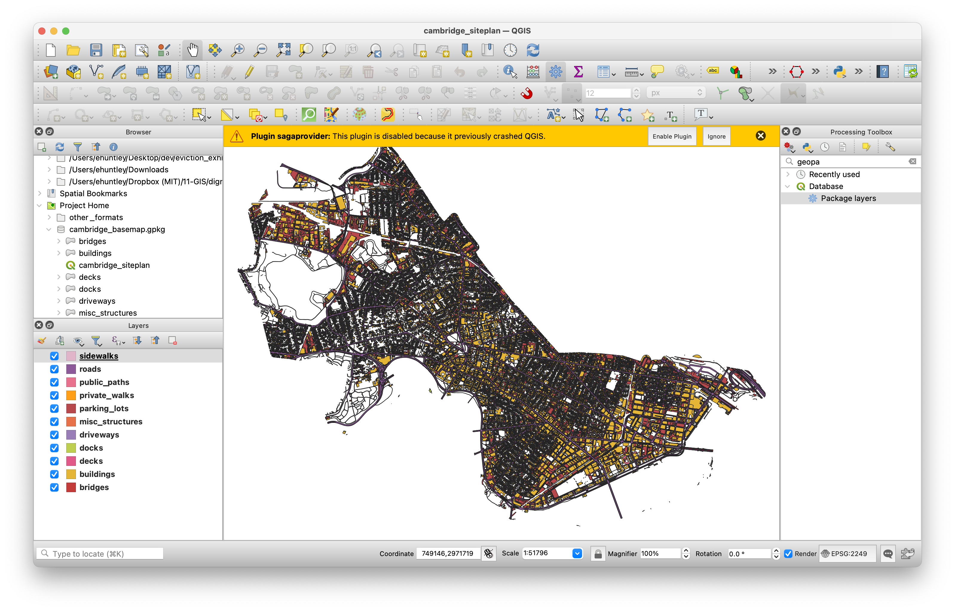
We’ve provided a QGIS project file called
cambridge_siteplan.qgz; when you open it, you’ll see layers
comprising a Cambridge basemap. These are sourced from the City of
Cambridge, MA, specifically the City
of Cambridge GIS.
If you dig through the project directory, you’ll see that we’ve
provided data in multiple formats. In the project itself, we’ve loaded
the feature layers from a geopackage (a
.gpkg)—this is a newer, open source spatial data format
based on a database technology SQLite that supports storing multiple
layers in a single file along with e.g., styling information and
metadata. (It also has the advantage of providing a single-file
interface to an entire project’s worth of data.) You’ll notice that
there’s also a QGIS project file stored in the geopackage:
geopackages can store QGIS project files as well. You’ll often find that
open source software plays well with other open source software.
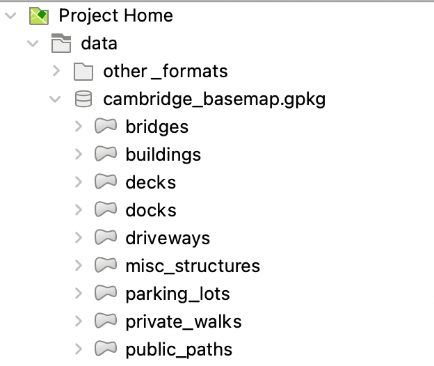
If you’re more comfortable with Shapefiles or GeoJSON files, though,
you can find these in the data > other_formats
folder.
Define Layout View and Bookmark
So far, we have all our layers loaded—it’s not pretty, but we’ll wait to make it so in Illustrator! Because we’re going to be relying on the Adobe Suite for styling today, we’ll leave it this way and proceed to framing and exporting our map.
First, create a new layout and give it the name “site plan output” or
one that makes sense to you. (File > New Print Layout)
When you open the layout, let’s resize our print page. You’ll find that
in urban design work, you’ll need to be able to work with page sizes
other than the standard letter size! Right-click the blank page and
select ‘Page properties’—you’ll see something like the below, with
different settings. Change these to match the below screenshot! I.e., a
custom page with a width of 17 inches and height of 11 inches. This page
size is commonly called ‘tabloid’.
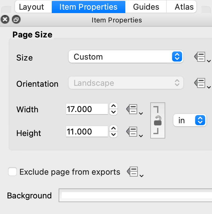
You can also use the size ANSI B—this is another name for tabloid. ANSI stands for the American National Standards Institute and these codes correspond to common pages sizes in the US. ANSI A is letter (8.5” x 11”), ANSI C is 17” x 22”, etc.
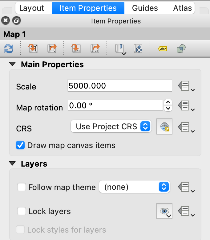
Add a new
map— —to
fill the page. Because in urban design and architectural work, you’ll
often want to be precise about the scale at which you’re working, we’ll
set this manually rather than zooming. Right-click on the map and choose
“item properties;” set the scale to 5000. (See below.) This means
—to
fill the page. Because in urban design and architectural work, you’ll
often want to be precise about the scale at which you’re working, we’ll
set this manually rather than zooming. Right-click on the map and choose
“item properties;” set the scale to 5000. (See below.) This means
1:5000, a fairly standard drawing scale for neighborhood
plans—in plain English, a given building will be 5000 times smaller on
the page than in the world. Now, slide the extent of the map around
using the “move item content” tool
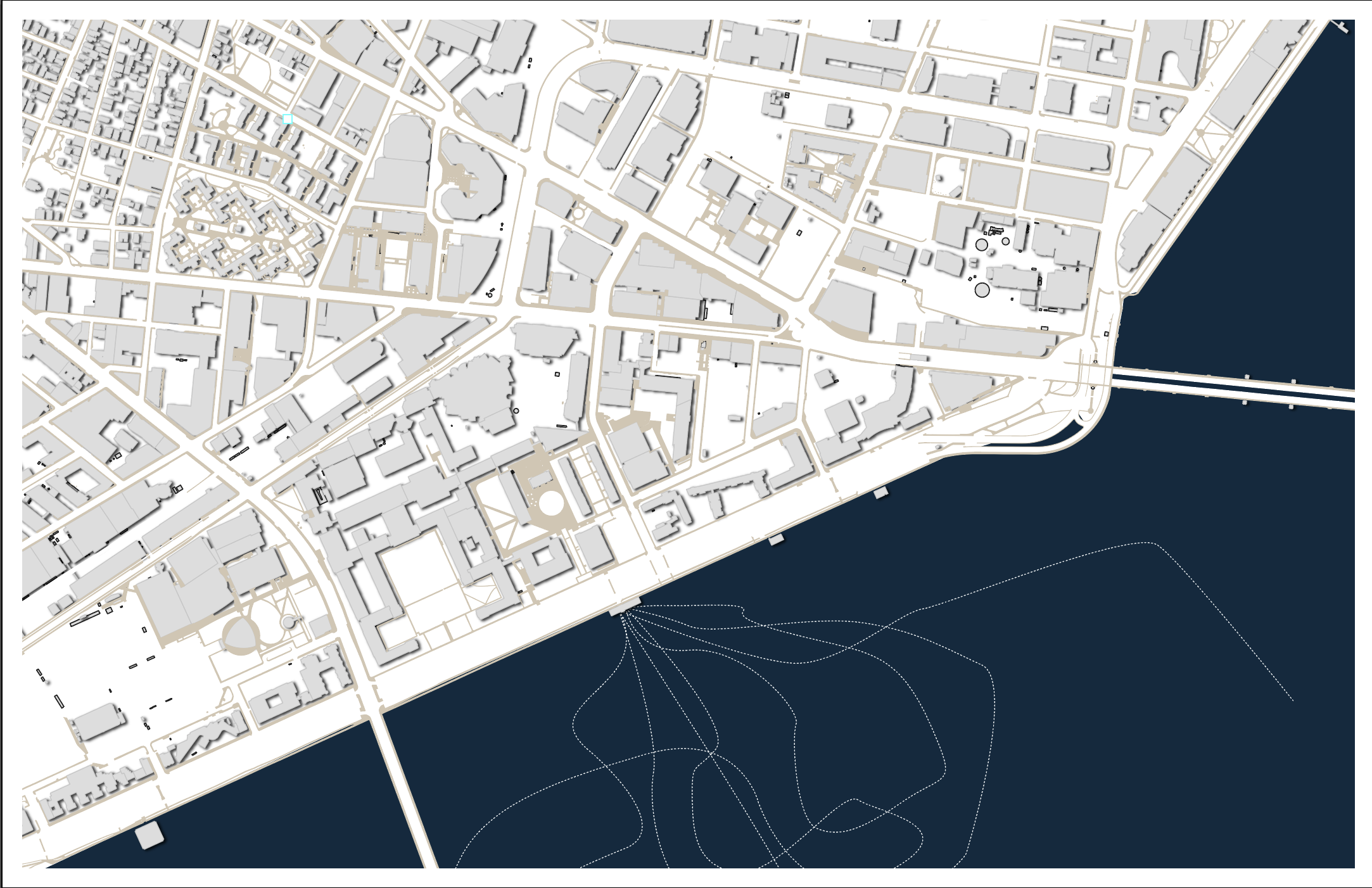
 to frame the area of interest. (I’ve chosen Kendall Square.)
Finally, click the Bookmarks dropdown at the top of the map properties and select “New bookmark” and give it a name (e.g., “Kendall”)—this is so that if you accidentally change the map extent, you can easily find your way back to the extent and scale of interest.
Finally, add a scale bar and north arrow. This will make our life in Illustrator much easier after we’ve lost the map’s explicit spatial information. Your map before exporting should look something like the below.
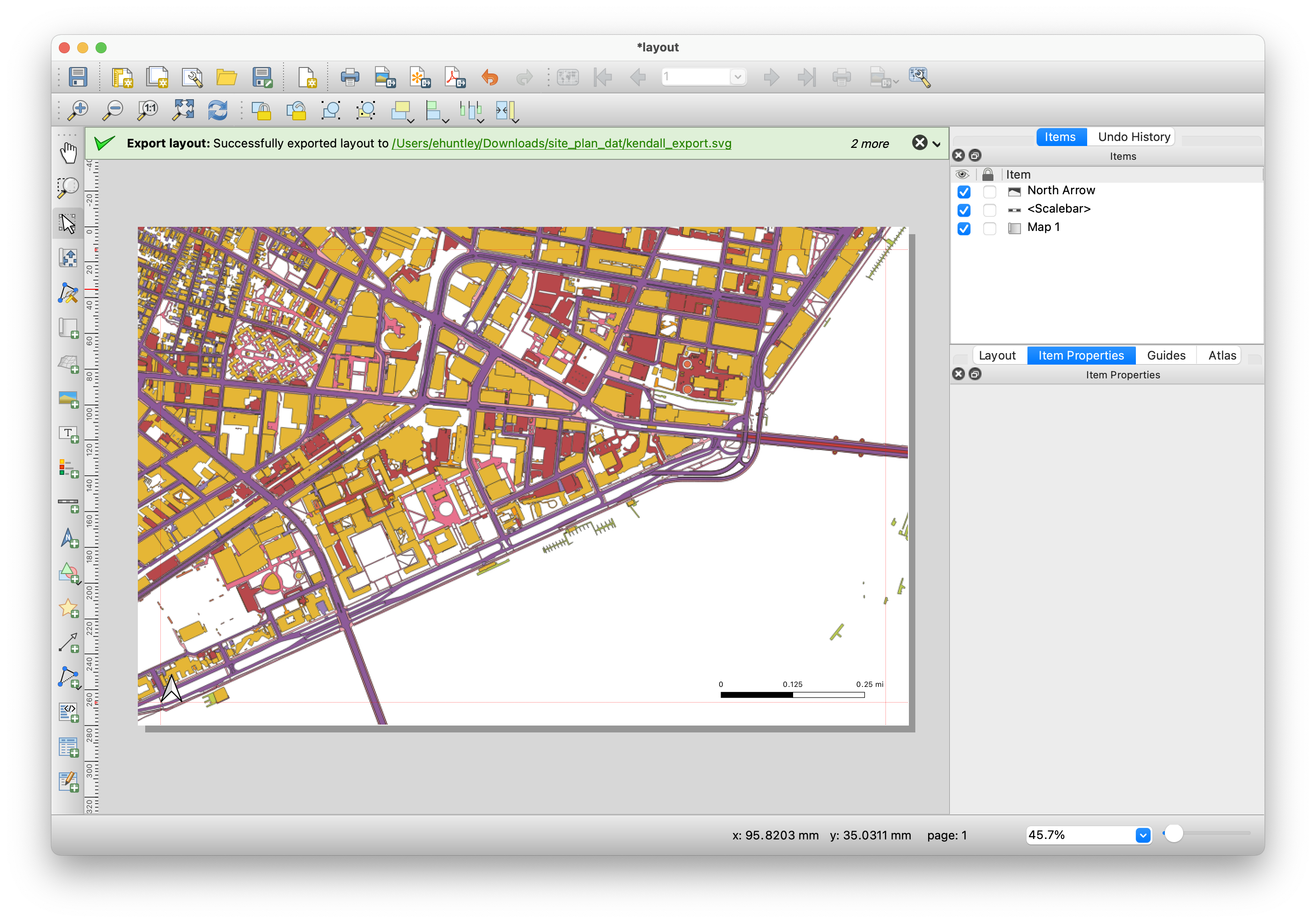
Export Your Layout as an SVG
We’re going to export the map as an SVG, or scalable vector graphic, format. This format is often the best way to bring vector graphics out of QGIS; it preserves layers and styles (to some extent) and Adobe Illustrator support the format fairly well.
Illustrating Illustrator
Get Familiar with the Layers Pane
At the outset, to make your screen look like the one we’re using,
change your workspace layout. Navigate to
Window > Workspace > Essentials Classic. We find that
this layout makes enough features available in the user interface
without being totally overwhelming. Obviously, feel free to try others,
but this is the layout we’re using in the workshop.
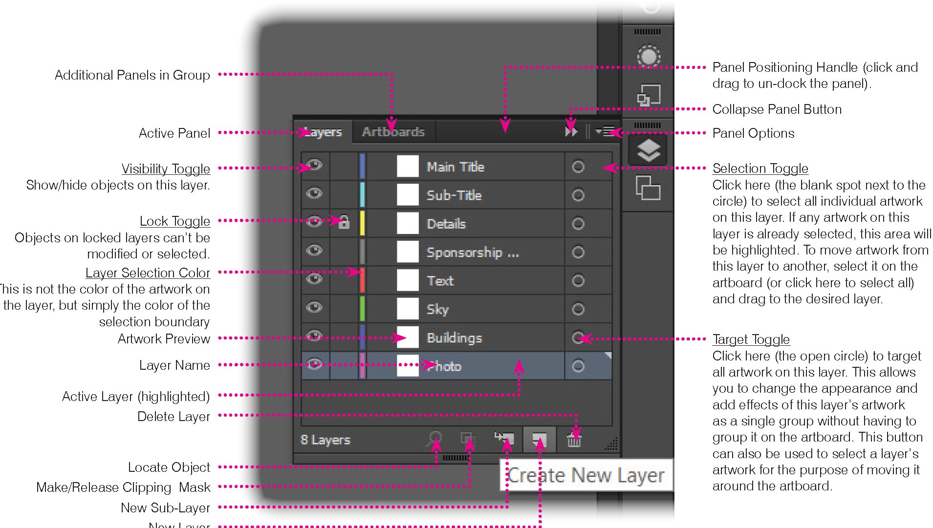
On the right, click the ‘layers’ icon’ and you’ll see a list of layers imported from GIS. This layer pane is just like the GIS layer pane! Picture a camera aiming down from the top of the list—this is how it will draw layers. Layers higher up the list will be drawn on top of lower layers in the list.
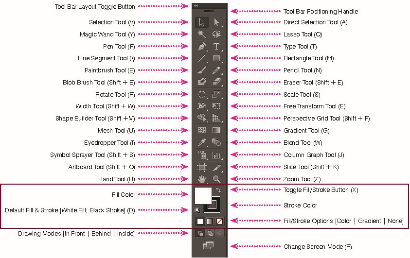
On the left, you’ll see a user interface making various tools
available to you. Until you get hotkeys under your fingers, this is
where you’re likely to be looking for things. In this workshop, we’re
mostly going to be using the pen tool (p), the rectangle
tool, (m), and adjusting the strokes and fills of our
shapes.
Style Layers
We’ll begin by doing some simple styling by adjusting strokes (i.e., outlines) and fills of the objects we imported from GIS. First, let’s do some cleanup. Your SVG may have brought in layers that contain no objects (these will be at the top of the list, called Layer 19, etc.). Delete them!
Next are your map elements—your north arrow and your scale bar. Create a new subgroup under the main layer and call it “Map Elements.” Drag the scale bar and north arrow into this sublayer.
Finally, we’ll group layers that will have the same fill and stroke colors. Create three new layers (buildings, paths, and car infrastructure) and group the layers as follows:
- Buildings (Buildings, miscStructures)
- Paths (Sidewalks, PublicFootpaths, PrivateWalkways, Decks, Docks)
- Car Infrastructure (Driveways, Parkinglots, Roads, Bridges)
Modifying Fills and Strokes
The fill color tool is the rectangle at the bottom of the tools panel that controls the fill color of the polygon. The stroke tool is the hollow rectangle at the bottom of the tools panel that controls the stroke/border color of the polygon. Stroke weight and type can be adjusted in the panel along the top of your project window. (You can toggle between the fill color and stroke tools by using the small arrow or the ‘x’ hot key.)
In this step, you will change the color and stroke of the layers as follows:
- Buildings: Fill color:
#DDDDDD, Stroke:#707071, stroke weight:0.5. - Public: Fill color:
#D2C6B2, Stroke: None. - Car Infrastructure: Fill color:
#FFFFFF, Stroke: None.
Follow this workflow to edit the layers, one by one:
- Select all polygons in the layer by clicking on the small circle to the right of each layer’s name.
- Use the Fill/Stroke tool to set Fill/Stroke.
- If you added stroke, you will see a stroke bar at the top panel.
Click on the word Stroke, a new pop up window will open where you can
adjust line type. Next to the word stroke is the line weight, it usually
defaults to 1pt, adjust as needed. You can also navigate to
Window > Stroke.
- Lock layer by clicking on the right box next to the layer’s name. You will see a lock icon show up in the box. (This has no cosmetic effect, but prevents you from unintentionally modifying or selecting a layer.)
Adding Volume to Buildings Using Effects
We’re currently staring at something that appears strictly planimetric—buildings are 2-dimensional footprints without a sense of volume or height. While in future sessions, we’ll learn to render site plans such that buildings throw shadows according to their height, here we’ll fake it using drop shadows. Select all buildings by clicking on the circle next to the ‘building’ layer in the layer pane.
Now select Properties, and click the “FX” icon, hovering over “stylize” and selecting “Drop Shadow.” I used the following parameters, but choose your own adventure! See what it does at the extremes, try something non-naturalistic (pink shadows?!)… realism is not the only option here, and it’s often the approach least likely to garner attention.
- Mode: Multiply (This changes how the shadow will be blended. We’ll talk more about blend modes in future sessions, but this is one of the most interesting tweaks you can make to your layers because it can make effects and features appear to blend into each other. “Multiply” literally multiplies the color values (which are stored as numbers) of two layers, creating what is probably the most “natural”-looking shadow. But again—naturalism is not the only option!)
- Opacity: 75% (How opaque should the shadow be? Higher values are less transparent (i.e., a harder, sunny-day shadow) and lower values are more transparent (i.e., a softer, cloudy-day shadow.))
- X Offset: 2 pt (How far should the shadow be from the building on the X axis? Larger numbers suggest taller buildings!)
- Y Offset: 1 pt (How far should the shadow be from the building on the Y axis? Larger numbers suggest taller buildings! X and Y together affect the perceived angle of the light source.)
- Blur: 1pt (Larger numbers give a “blurrier” shadow, smaller numbers give a “harder” shadow where edges will be clearer. Hard edges suggest a stronger, closer, more direct light source.)
- Color: Black
Repeat for anything else that could be expected to throw a shadow: ‘bridges’, ‘docks’, others…
Land vs. Water Using the Pen Tool
One thing you may have noticed is that the background is the same for the land and the water; we’ll create a distinction by drawing a land feature using the pen tool and creating a background.
If your project doesn’t already have a background layer, create a new layer in the layers panel and name it ‘background.’ With this layer selected, use the rectangle tool (hotkey: M) to draw a rectangle the size of the drawing frame. Because you had the layer selected while drawing, the new feature will be in the ‘background’ layer.
If your project does have a background layer, simply select the object on the layer (click the circle!).
Change the color of the object by navigating to the “properties” tab, and changing the fill appearance.
Create a new swatch by clicking the plus sign along the bottom and name it “land gray.” A swatch travels with your illustrator document and is a color that you can reuse easily. Change your RGB (Red, Green, Blue) values all to 234. When all of these share a value, you’re working along a white-to-black color scale. When you click “OK’, the color of the background should change.
Use the pen tool (P) to draw a polygon where the river should be (I leave this to you—probably best to do some research using aerial imagery). The pen tool uses Bézier Curves to create curvy (or straight) lines; when you hold a click down, you can adjust the curvature of the line. If you simply click, you will have created a straight line that comes to a point. Make sure you close the line so that it creates a polygon.
Add another layer, calling it “river background” and move this new
polygon to that layer. Change the polygon’s fill color to a blue that
you like (or, again, not!) and place it above ‘grey background’. (I used
RGB values 13, 42, and 63, aka #0D2A3F.)
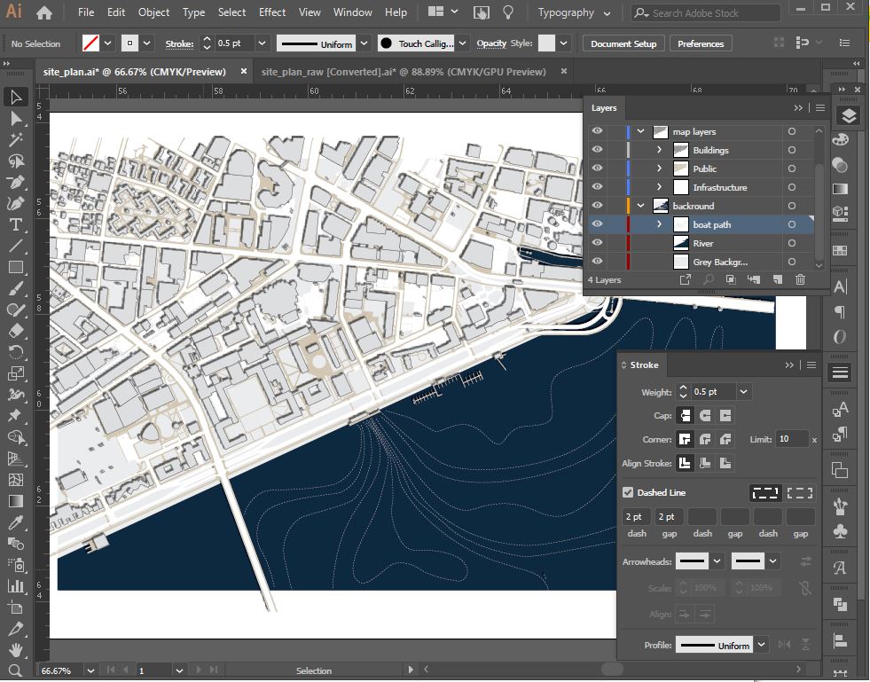
Draw Boat Paths
So far, we’ve been adhering VERY closely to our GIS data. But the reason we use Illustrator is because it’s a much more fluid drawing and diagramming tool! Create a new layer called “boat paths”, and place it above the river layer.
Use the pen tool to draw several polygons to indicate boat paths on the water. All lines should start at the MIT Sailing Pavilion. Fill color should be empty with a stroke color of your choice.
Now we’ll adjust the stroke of the boat path—solid lines create the feeling of fixed things: walls, borders, etc. Boats move! So let’s use a dashed line style. In the stroke panel (window > Stroke, or click “stroke” under object properties), build a dashed line stroke with a 1.5 pt dash.
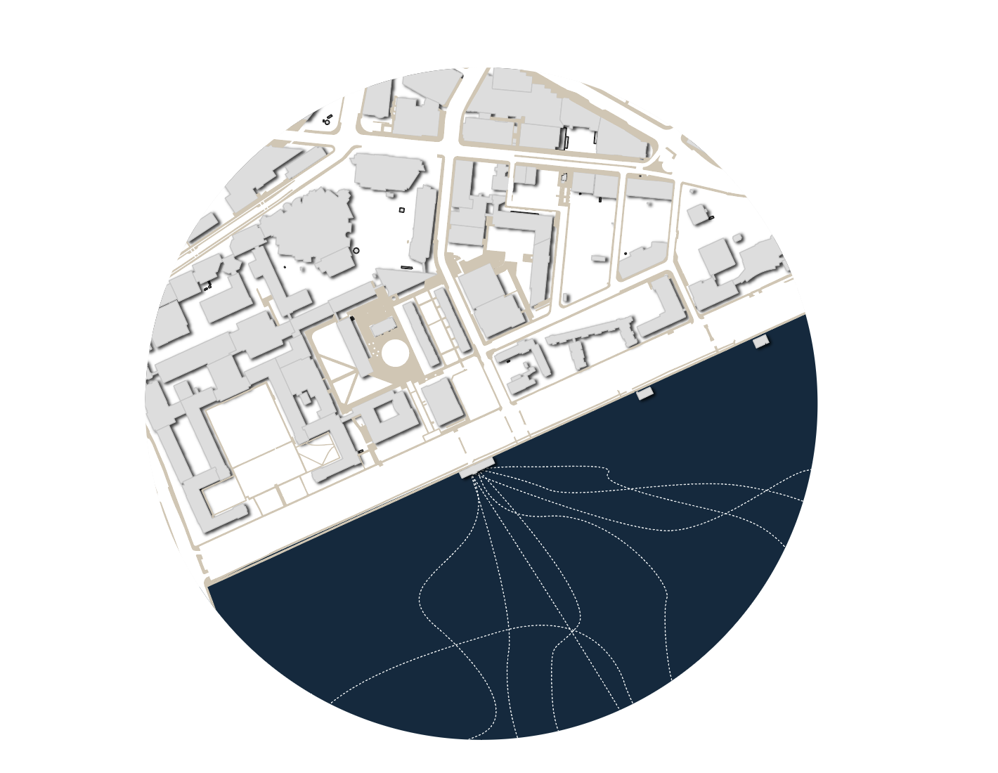
At the end of this stage your image should look something like this…
Insert a clipping mask.
As you’ve probably noticed, there’s a lot of stuff spilling over the edges of our page. Let’s fix this by creating what’s called a “clipping mask”—this is a shape that’s used as a cookie cutter for the rest of the objects below it on a layer. Let’s create a clipping mask that preserves a little white space around the edges of the map.
First, we’ll want to be able to draw a rectangle that is precisely 0.25” from each edge. There are a few ways to do this, but let’s use one that introduces something new: grids! If you hit command-R (ctrl-R on a PC), rulers will come up above and to the left of your artboard. They’ll probably appear in points or millimeters—simply right-click them one-by-one to change them to inches.
Then, in the top menu, navigate to
Illustrator > Preferences > Guides and Grid. Set it
up so that there’s a gridline every 1 in and that there are
4 subdivisions per grid line. (We want a quarter-inch remember?) Then,
click View > Show Grids, and
View > Snap to Grid. This ensures that shapes you draw
snap to the edges of the document grid. Draw a rectangle that snaps to
the first grid subdivision from the edge of the page in each direction.
(It will probably be easiest if you hide your other layers.)
Finally, ensure that that rectangle object is placed at the top of your list of layers, within the “Layer 1” group. The clipping mask operation expects the object doing the clipping (here, our rectangle) to be at the top of a list of layers to clip. Select the “Layer 1” group and then click the “make/release clipping mask” button at the bottom of the layers pane.
Of course, you don’t have to use a rectangle! If you wanted to get creative, you could use a circle… simply do everything as above, but create an ellipse instead of a rectangle.
You could use text, if you wanted to be REAL dramatic… simply create
some giant text, then use Type > Create Outlines, and do
one or two additional steps outlined here. This text can then be
used just like any other shape in Illustrator, including as a Clipping
Mask.

Excellent!
Nice work! You’ve brought GIS data from QGIS into Illustrator and started learning some of the basic commands and tools that’ll create a stylish basemap that can communicate your design intention and serve as a starting point for the design itself.