Map, Meet Ground: Topography, Bathymetry, and Terrain

Eric Robsky Huntley, PhD (They/them)
- Lecturer in Urban Science and Planning
- ehuntley@mit.edu
Tutorial Information
Methods
Tools
In Massachusetts, we are decidedly coastal. This means that, in some ways, there are two -scapes to represent: land- and sea-. The trouble is that bathymetry data is somewhat more difficult to come by than its terrestrial counterpart. If you are working in the United States, one of the most reliable data sources for conjoined elevation/bathymetry digital elevation models (DEMs) is the National Oceanic and Atmospheric Administration (NOAA)’s Digital Coast. You’ll want to draw a rectangle around an area of interest and choose the 2016 USGS CoNED Topobathymetric Model (1887 - 2016): New England dataset. I’ve provided a sample dataset covering Deer Island and the Logan Airport-adjacent part of East Boston in Massachusetts.
We’ll be using three different representational techniques appropriate for topography and bathymetry:
- Hillshading, or an approach that simulates the effects of light on a landscape, approximating a quickly executed render.
- Contours, or lines of equal elevation placed at regular intervals;
- Dot matrix; this gives a sense of elevation through density of points. It’s similar to the way old printers made images, but we’re going to be taking advantage of our GIS’s ability to size points on the basis of a variable value.
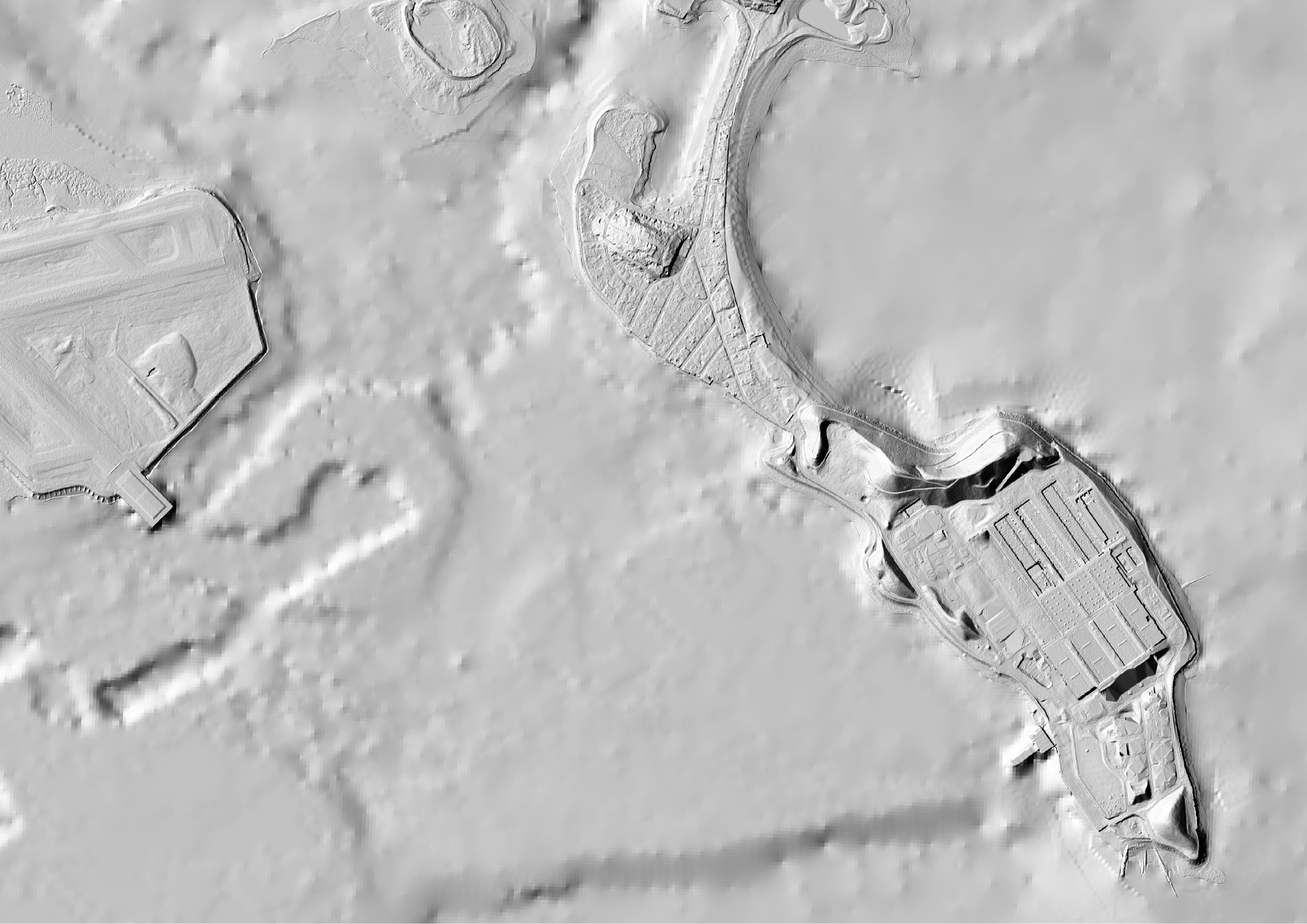
Hillshade
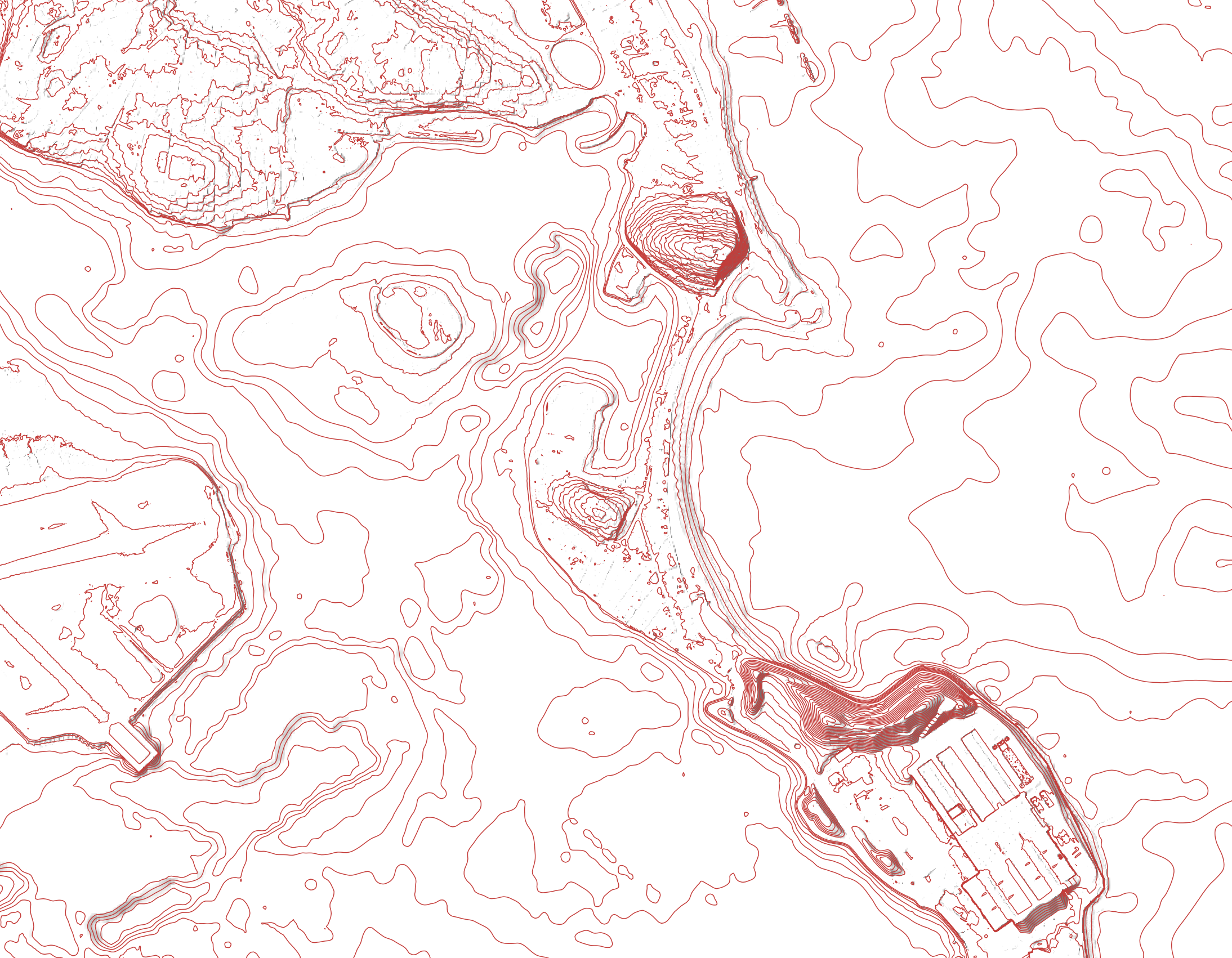
We’ll next use a standard set of cartographic conventions to depict the terrain-as-such. While the interpretation of the digital elevation model at hand is straightforward (brighter color, higher elevation), we can’t really say it reads, visually, as terrain.
To hillshade, search in the Processing toolbox for ‘hillshade’. Use the one that appears under “GDAL”, as it will give you more options. Your input raster is your clipped DEM. The Azimuth is the position of the ‘sun’, measured in degrees from north, and the altitude is its vertical angle, measured in degrees from the horizon line.
By default, these are 300 and 40, placing you in late afternoon… in the southern hemisphere. You may think that you want to change this to be more reflective of our location in Massachusetts. Maybe… or maybe not.
There’s been a lot of perceptual research done on lighting angles and hillshades, and it turns out that when the map is ‘lit’ from the bottom, folks tend to invert the terrain and see mountains as valleys, and vice versa. (As always, test this for yourself if you’re curious! I’m pretty non-opinionated on this particular thing.)
The Z-factor is another place to play: it turns out that most of those grand, topographic maps are grossly exaggerating the vertical height of terrain. I usually use a factor of 3-4, but your results may vary.
Run it with settings of your choice. This is with Azimuth 315, Altitude 45, and Z-factor set to 4.5. It’s also good to select ‘multidirectional shading’, which does a slightly better job emulating the effects of light in the world.
You might notice that the terrain appears a bit too granular: we’re losing the general sense of the landscape in its wrinkles. To address this, we’ll try averaging values. We do this using neighborhood statistics - search for r.neighborhood in your processing toolbox. Your input raster is your clipped DEM. Save it as a new output raster (name of your choosing). Your neighborhood should be 41 cells.
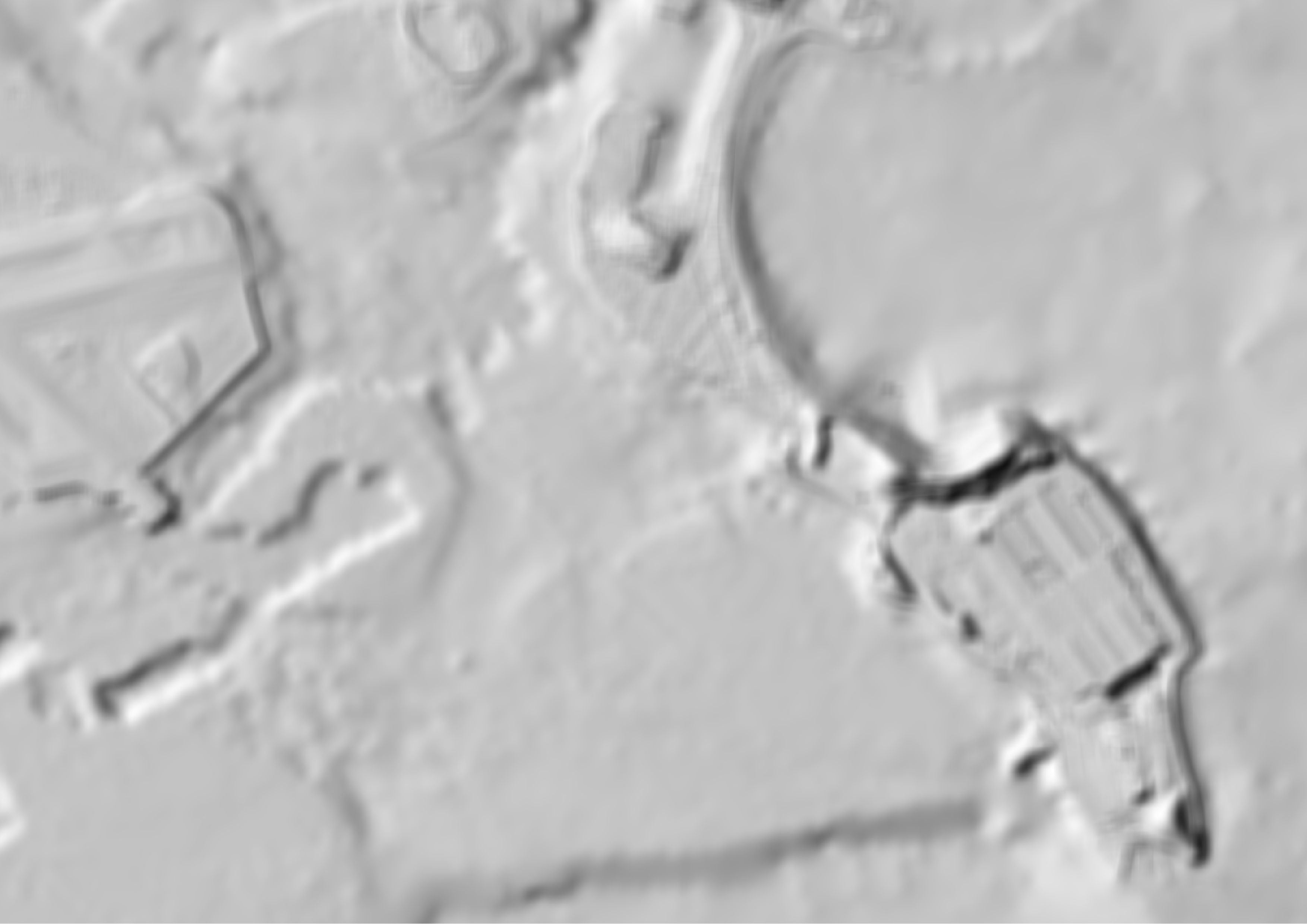
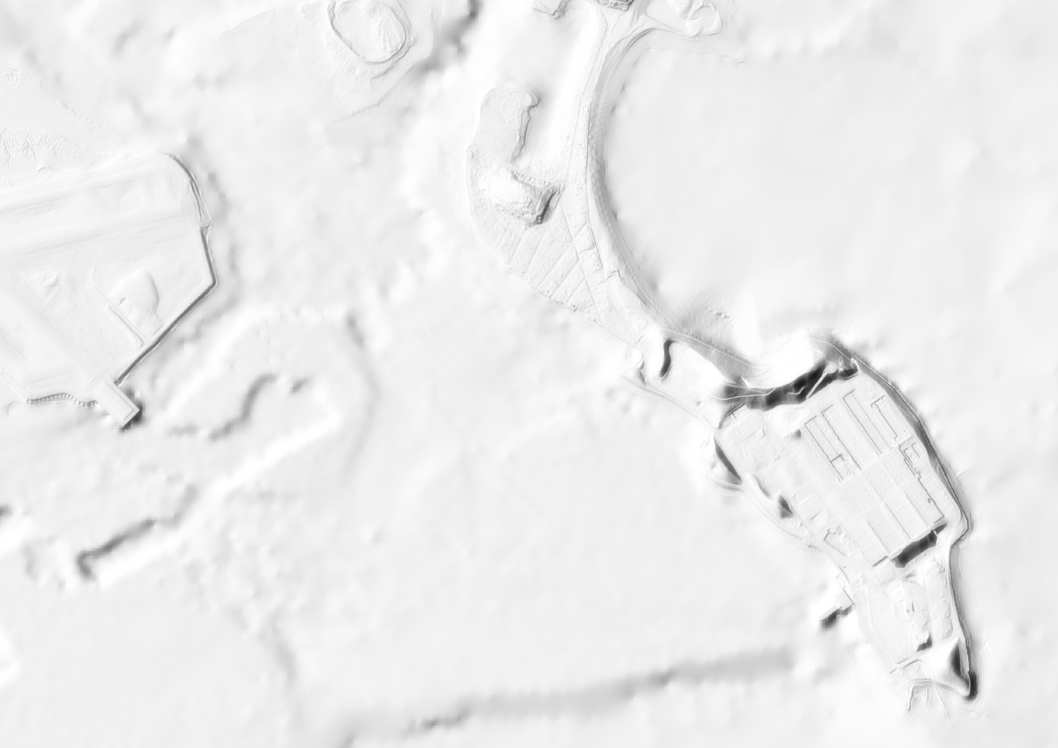
While this may seem like a blurrier version of the previous hillshade, we can combine them to great effect. Place the unaveraged layer above the averaged layer in the draw order. Under your layer symbology’s advanced properties, set it to a ‘screen’ blending mode. We get both the detail of the initial hillshade with the sense of the whole that came with averaging. Beautiful!
Contouring
Now, we’ll produce contour lines from our averaged raster. In your geoprocessing toolbox, search for ‘Contour’.
Your terrain representation here is going to depend on the scale of your map. I used a contour interval of 5 (ft), but this may be too tight for maps depicting more of the landscape - try 10, or even 20 if so. Your z factor here should be 0 - no reason to exaggerate the vertical height of these lines. Again, feel free to play! You can use ‘Produce 3D vector’ under advanced parameters if you want to bring this into e.g., Rhino eventually. We now have contour lines with which to more clearly articulate grade changes.
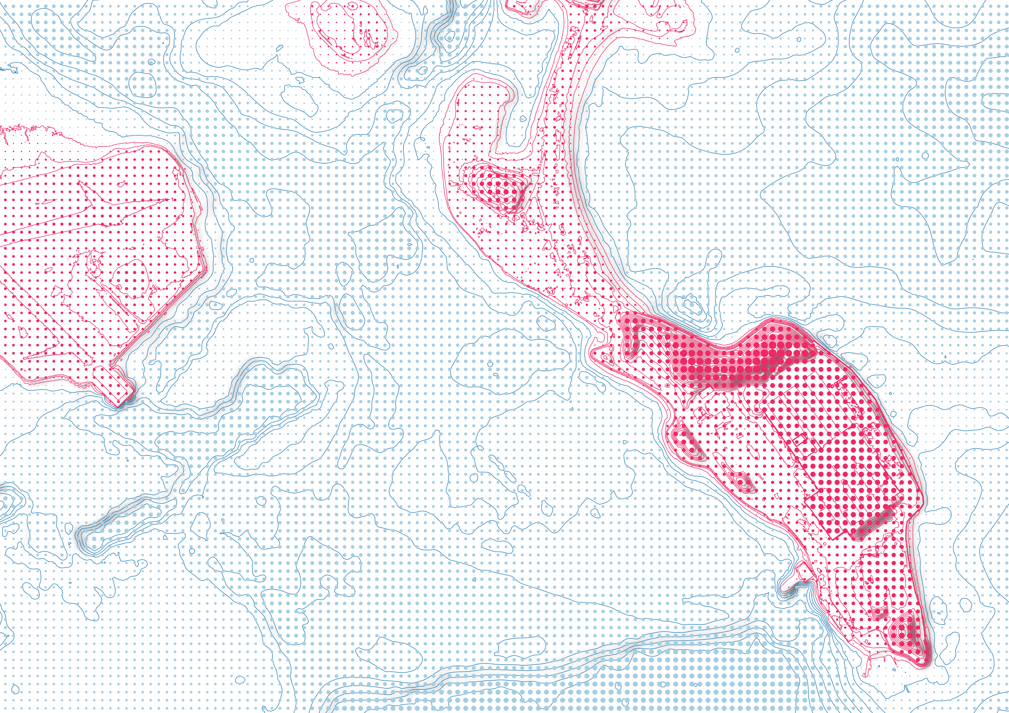
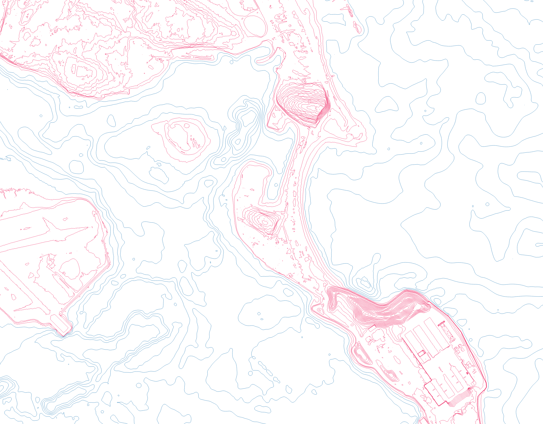
But! We can also use these to make clearer the distinction between land and water in our map. Let’s set up a display filter. We’re dealing with coastal landscapes, so we know that this break is going to occur at an elevation of ‘0’ - lucky for us, our contours record their elevation!
Right-click the contour layer and choose ‘Symbology’. Select
“Rule-based.” Create two new rules: the first should be where
"ELEV" >= 0 (i.e. land) and the second should be where
"ELEV" < 0 (i.e., water). Set different symbol colors (I
use blue and, what else, magenta).
Dot Matrix
As a final measure, let’s try something that breaks with modern cartographic convention and hearkens to earlier computational styles of cartographic production—a dot matrix, similar to what a pre-inkjet printer would use.
To begin, we’ll need to create a regular grid. Search for ‘Create Grid’ in your processing toolbox. Use a ‘Point’ grid type. The ‘Grid Extent’ should match your terrain layer. Specify vertical and horizontal spacing of 100 feet each. Save it as a new shapefile (name of your choosing). You’ll wind up with a thick mesh of points (these are the ‘label points’). Currently, these are pure geometry - we want to give each point the value of DEM where it sits.
To do this, we need the ‘Drape (Set Z value from raster)’ tool. Your
input features are your points and your input raster should be your DEM.
The other settings should be just fine. Save it as a new layer. (I
called mine elevated_grid.)
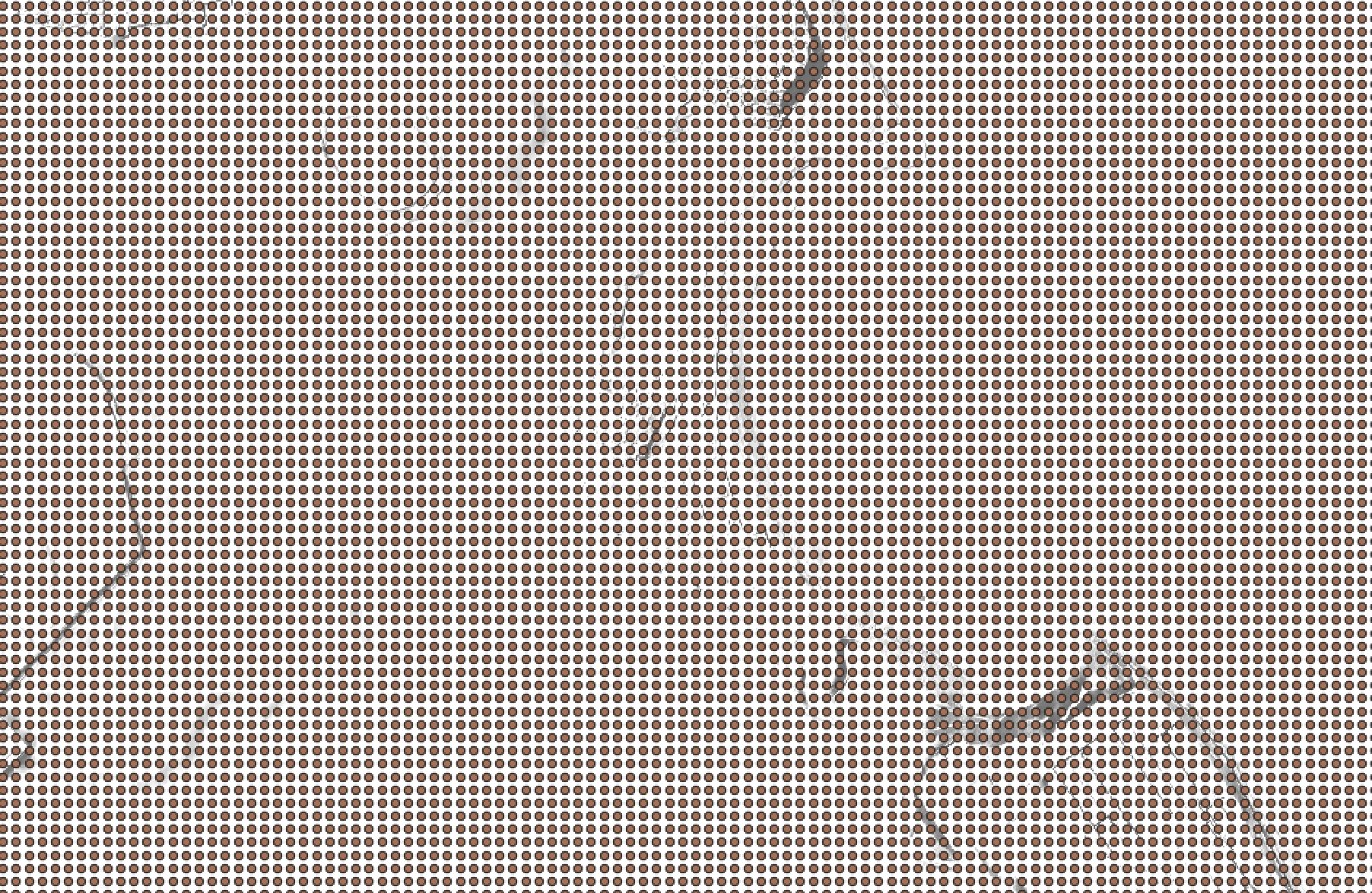
If you open up the later’s attribute table, nothing appears to have
changed. However! We’ve given each point a Z-axis in its
geometry—we can access it using the geometry properties. Open the
symbology, and make a ‘graduated’ map. Under the expression dialogue,
simply type $z—this is the elevation property.
Visualizing the data using a simple graduated map, we get something like the below.
This is already looking a little bit beautiful (although this also
makes very clear that the difference between a vector dataset and a
raster dataset can be somewhat fuzzy), but let’s go further. We’re going
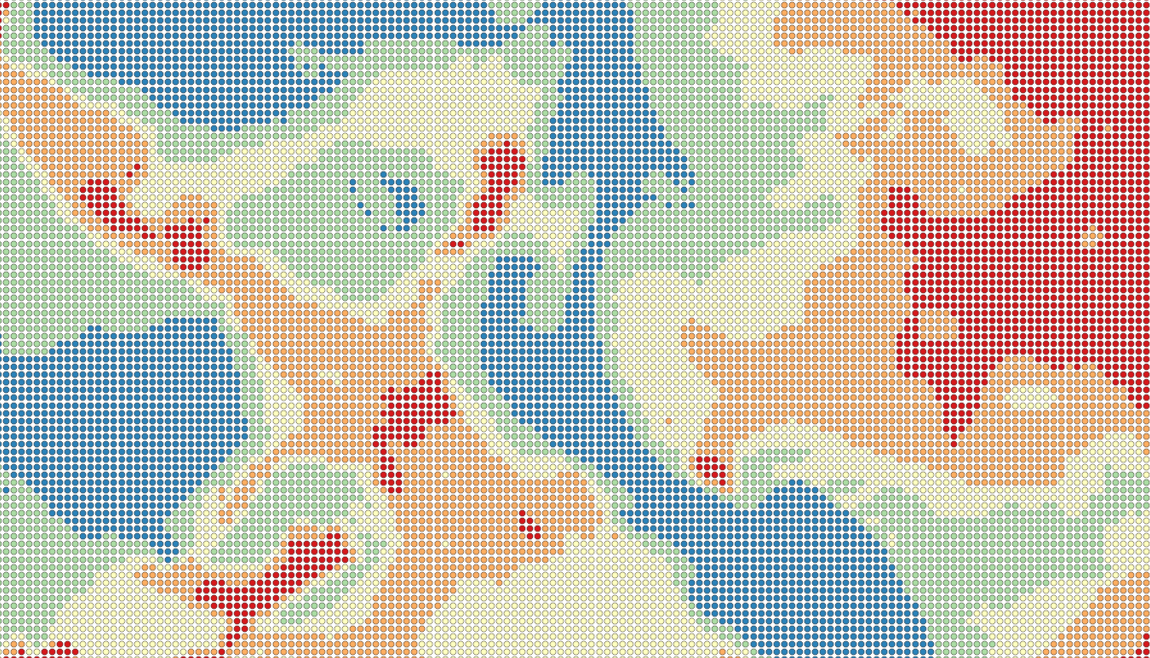
to base the size of each point on the raster value: this will create a
sense of density at higher elevations. We also want to distinguish
between land and water again. Just like above, set a rule-based
symbology based on the $z value. (For example,
$z >= 0.)
Next, in the rule pane for the land rule, set the Symbol’s size using
the data-defined override assistant. (It’s the drop-down to the right of
the wrench icon.) We need to size our points such that the dots in our
dot matrix range from 1 map units (feet) to 100 map units—recall that
this is the grid size! Our points will come close to filling up the grid
when they’re at the maximum value. Your source is $z, and
your values, for land, are 0 to the maximum value (you’ll need to change
the lower value). Your output sizes are from 1 to 100. Scale method is
up to you—this affects how quickly the points change size across the
data range. (I often use ‘surface’.)
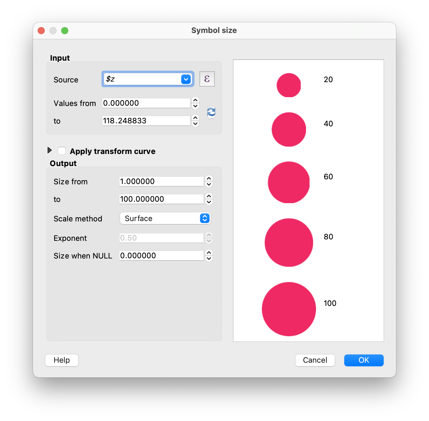
Click ‘OK’. Make sure your ‘size’ units are “map units” so that 100 means 100 feet. If you click ‘apply’, your land points should now look something like the below.

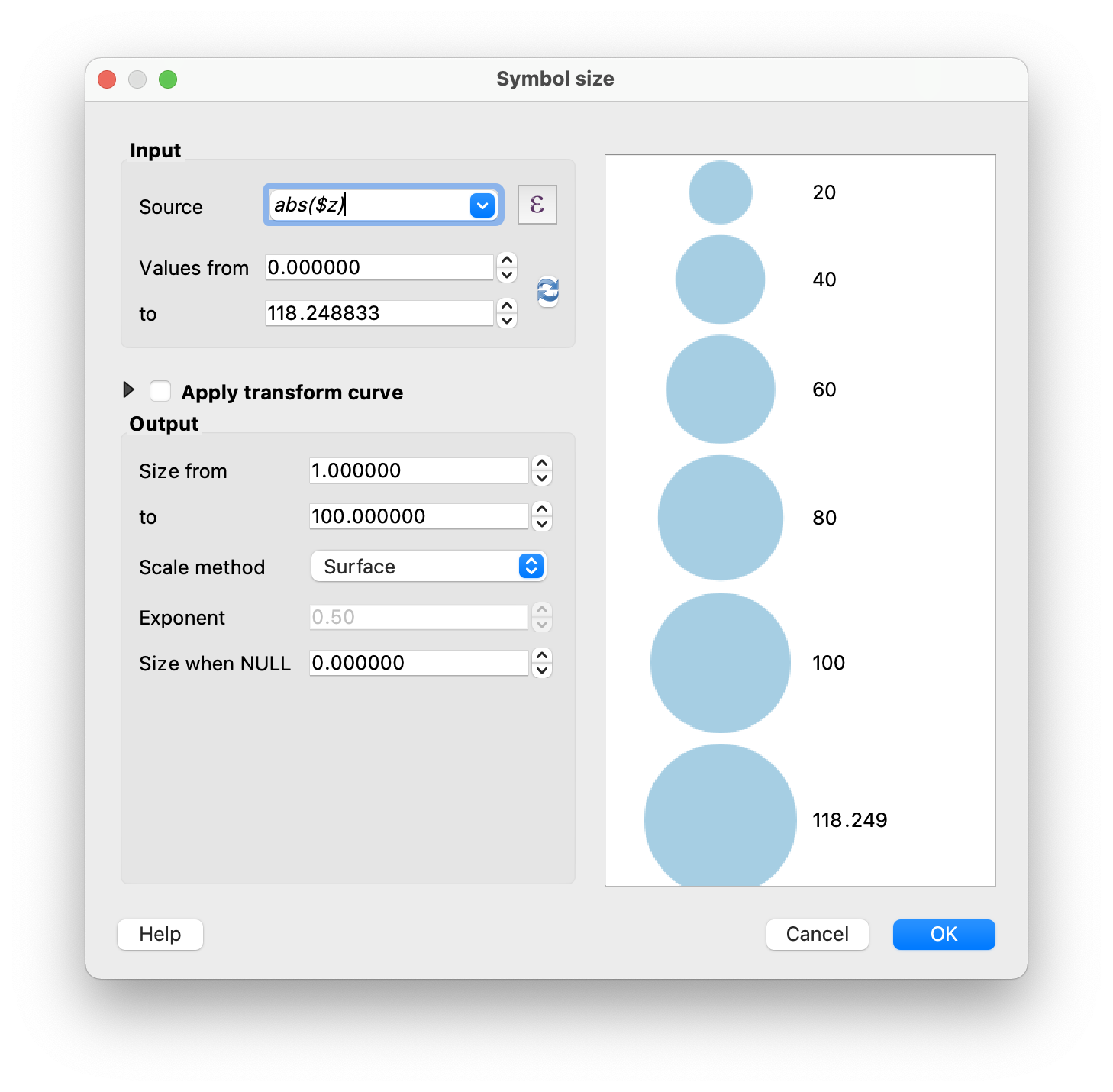
Do the same for your water rule! Here, though, you’ll want to set the
input source to abs($z): the absolute value of z, because
these are negative. This will cause the points to grow larger as the
value gets smaller. In both of these cases, you’ll want to use the same
maximum value so that the water doesn’t appear to drop off much more
quickly than the land (or vice versa).
Finishing Up
You can play with overlaying all three of these elevation visualizations in different ways. I find that the dot matrix and the contours give a nicely adequate sense of terrain, particularly when combined with a very light hillshade layer below—try increasing the brightness of the hillshade so that only the darkest shadows appear. There are, of course, many more techniques for visualizing elevation, but this gives you a good start to producing compelling, grounded (literally) maps!