Designing Boards and Reports using InDesign

Eric Robsky Huntley, PhD (They/them)
- Lecturer in Urban Science and Planning
- ehuntley@mit.edu
Tutorial Information
- Module 4 in Design and Representation for Planners.
Methods
Tools
InDesign is often used for preparing poster and book layouts. It gives you control over an enormous number of document properties, while linking images and other resources in a way that allows you to modify them alongside the layout. (If, say, you want to make changes to a site plan after you’ve already layed out your report.) This tutorial will introduce you to some basic time-saving features that will help you get started. While we’ve decided to structure this tutorial around a report-like document, the principles are easily transferrable to other document types.
Document Setup
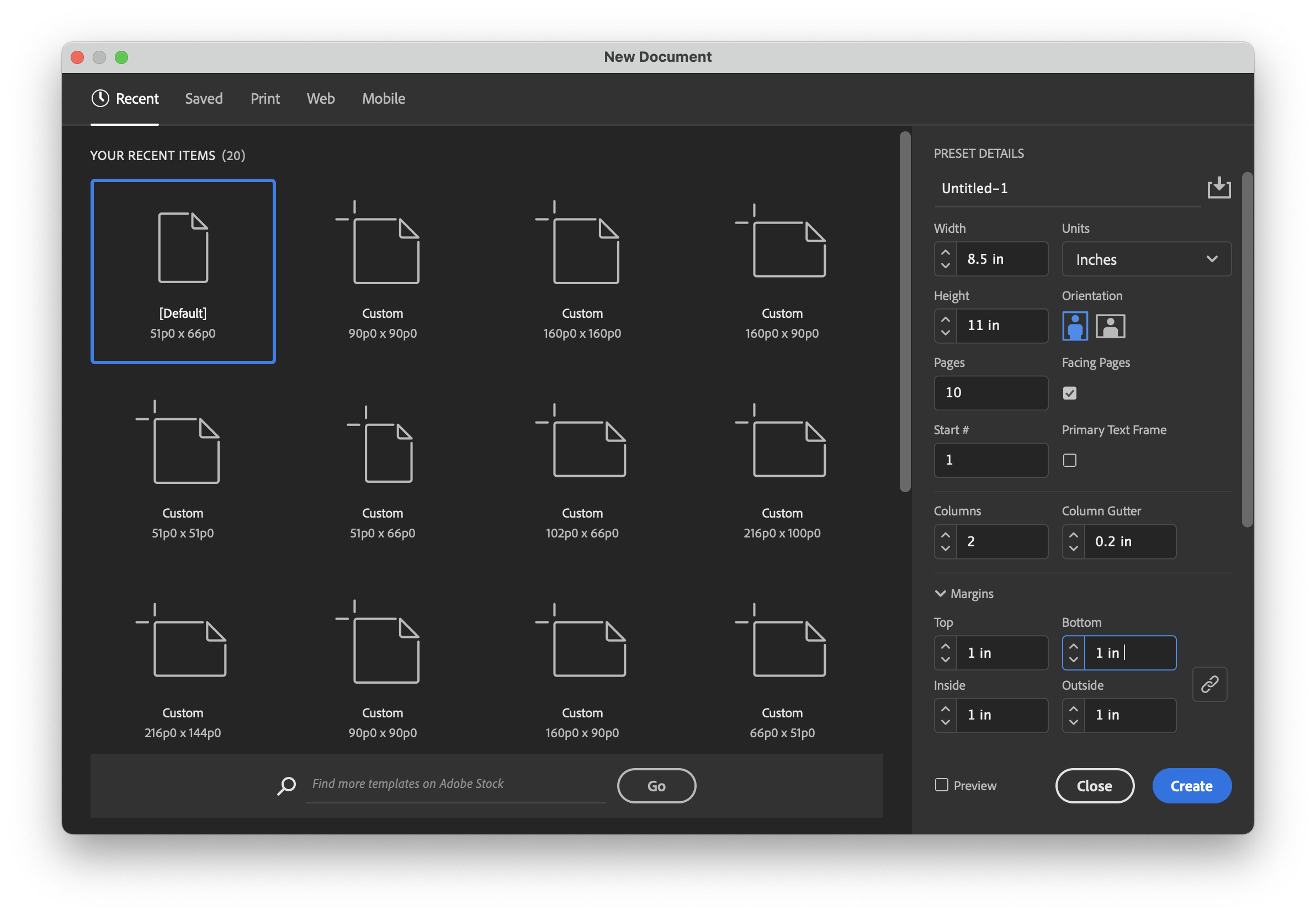
Create a new document by navigating to
File > New Document. This is where you define the basic
shape of your report or board. (At any time, you can change these
definitions through File > Document Setup.) For this
exercise, we want to use the following parameters:
Units: inches
Here, we define our document units. If the metric system is more your speed, use millimeters! If you’re designing for digital media, use pixels! We’re designing for American letter size, so we use inches here.
Width: 8.5”
Height: 11”
These are the dimensions of your document. 8.5” x 11” is a standard letter format. (Note that when giving dimensions as “a by b”, width goes first.)
Pages: 10
Here, we give ourselves many pages to work with.
Orientation: portrait
As opposed to ‘landscape’: a portrait is taller than it is wide.
Check the box for “Facing Pages”.
This means that pages will be displayed alongside each other, as they would be in a report that is printed double-sizded.
Columns: 2
Two-column layouts are fairly standard. Type designers will tell you that shorter lines are easier to read, so it’s common to split a document page into multiple columns to shorten the reading length of each line.
Column Gutter: 0.2”
How much space do you want between the columns? We use 1/5 of an inch; you can play with more or less, though an excessively wide gutter will make a page feel disjointed, and an excessively thin gutter will make a page feel cramped (and reduce the clear division between the two columns).
Margins: 1” (all)
Familiar to anyone who’s ever tried to squeeze more pages out of a fixed number of words (ahem). 1” is fairly standard and gives enough room (ish) for folks to jot down notes in the margins.
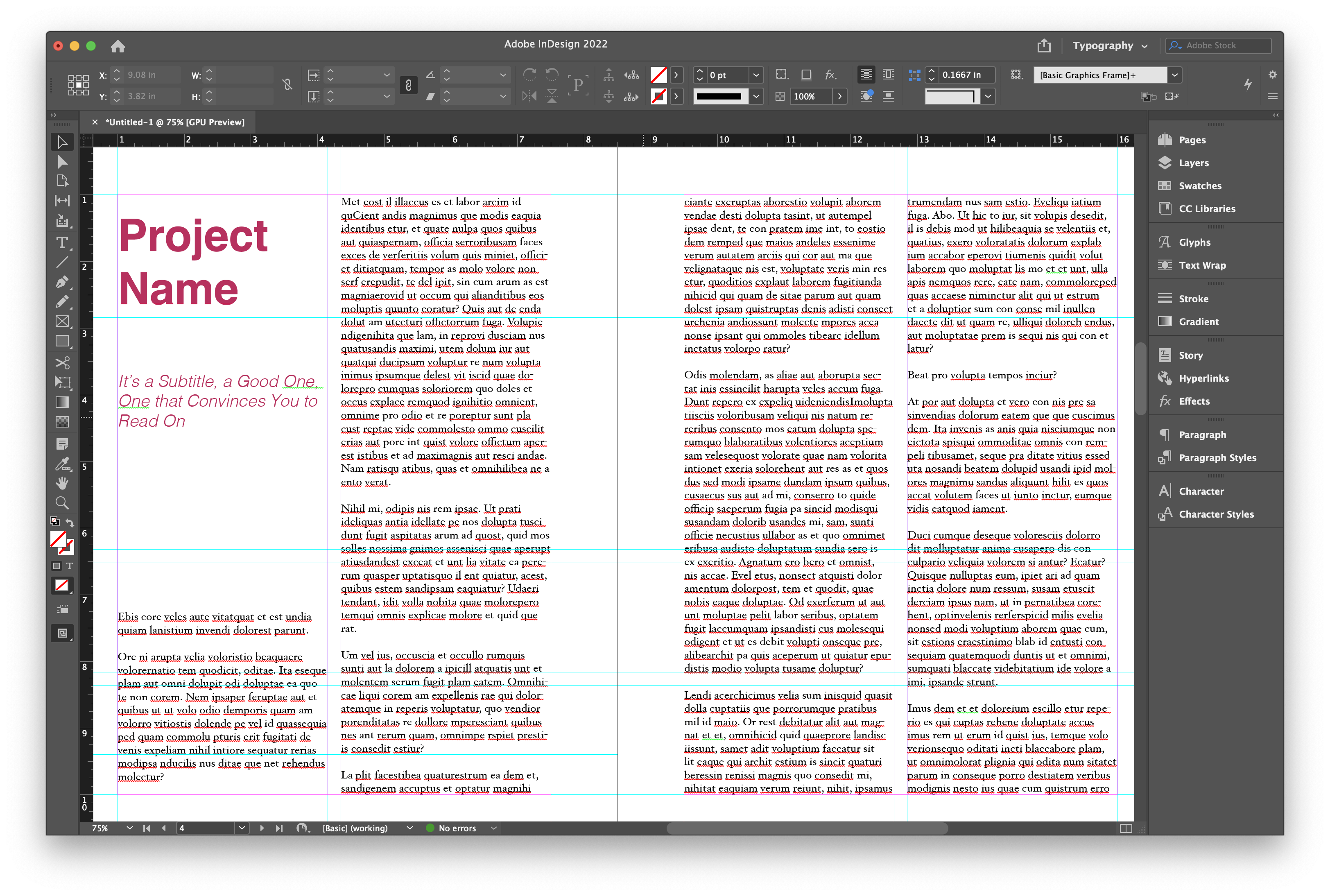
Next, Choose your work space. go to
Window > Workspace > [Typography]. This setup
includes the tools we’ll be using today: pages, layers, stroke,
paragraph styles, character styles.
Add Text and Define Paragraph Style
Defining paragraph styles will save you an enormous amount of time in the long run, though it takes a bit more intentional setup up front (if not necessaarily more time). It enables you to change the the style of all elements of a particular style at once. This is similar to the analagous feature in Word, LibreOffice, or Google Docs.
Use the type tool (t) from the left panel to create 4 new text boxes and enter a different text to each box:
- A title for your project.
- A subtitle for your project.
- A box for body text. Unless you have text on hand, you can simply
select the box, and navigating to
Type > Fill with Placeholder Text.
Now, we’ll define paragraph styles! Click on the Paragraph Style icon in the right panel. Click on the “create new style” icon at the bottom right to create a new paragraph style. Double click on the style for editing options.
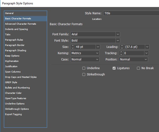
Make sure to name your style and to define font, size, and color. Define four styles.
- “Title” : Font size 48, font family Helvetica (or its less
pretentious near-twin, Arial), with a Bold font style. I gave it the
color
#C61E5E(see ‘Character color’). - “Subtitle” : Font size 18, font family Helvetica (or its less
pretentious near-twin, Arial), with a Light Oblique style. I gave it the
color
#C61E5E. - “Body”: : Font size 12, font family Georgia (or Garamond, or Minion, or any other Serif font), with a Regular style. Also, set the ‘paragraph spacing’ to 0.2”.
To apply style to a text box, click on at text and than choose the desired style from the paragraph style menu.
Note that we’re adhering to some fairly conventional styling decisions here—we use a bold sans serif title font, an italic sans-serif subtitle font, and a serif font for our body text. This is extremely standard. But note that you can diverge from this! I, for example, often use small-caps styled serif fonts for headers—this gives a document a more ‘bookish’ feel. Play around, take note of what you like in the world, and find your own style.
Use Grid and Guides to Organize Layout
Using a grid is a quick way to create an organized layout. The
easiest way to set up a grid is to use ‘guides’, which are non-printed
lines used for aligning objects. Much of the guide creation process can
be automated using Layout > Create Guides. For our
current document, you could try, for example, 5 rows and 2 columns, with
0.2” gutters (generally, I build my grids within my margins not the
page). Note that we used a 0.2” gutter for our columns as well. It’ll
help the document feel regular and rhythmic if you use the same (or
multiplicative—i.e., 0.4”, 0.6”) measurements throughout. You can also
create guides manually by dragging them guidelines from the top and left
rules to help you organize the layout.
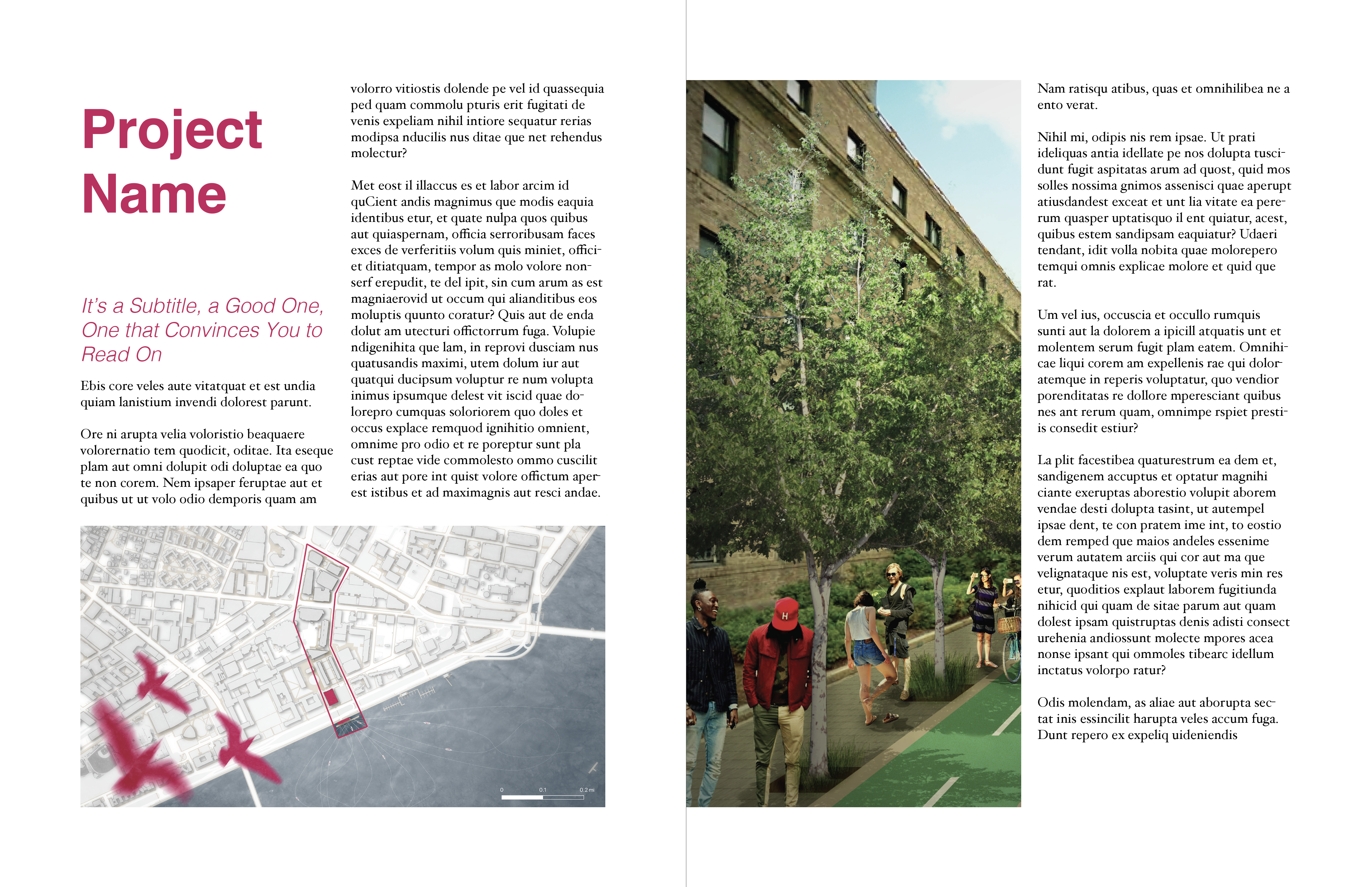
Note that I’ve filled by entire page with text—furthermore, when I add more text, it will automatically overflow into the next text box. I did this by selecting the text box and clicking the little box in the lower-right corner. You’ll see text appear next to your mouse. When you next click, you’ll deposit another text box that you can shape onto the page.
Add Images
Drag and drop images into the InDesign artboard. One click on the image will let you add the frame size and location. Double click on the image will let edit size and scale.
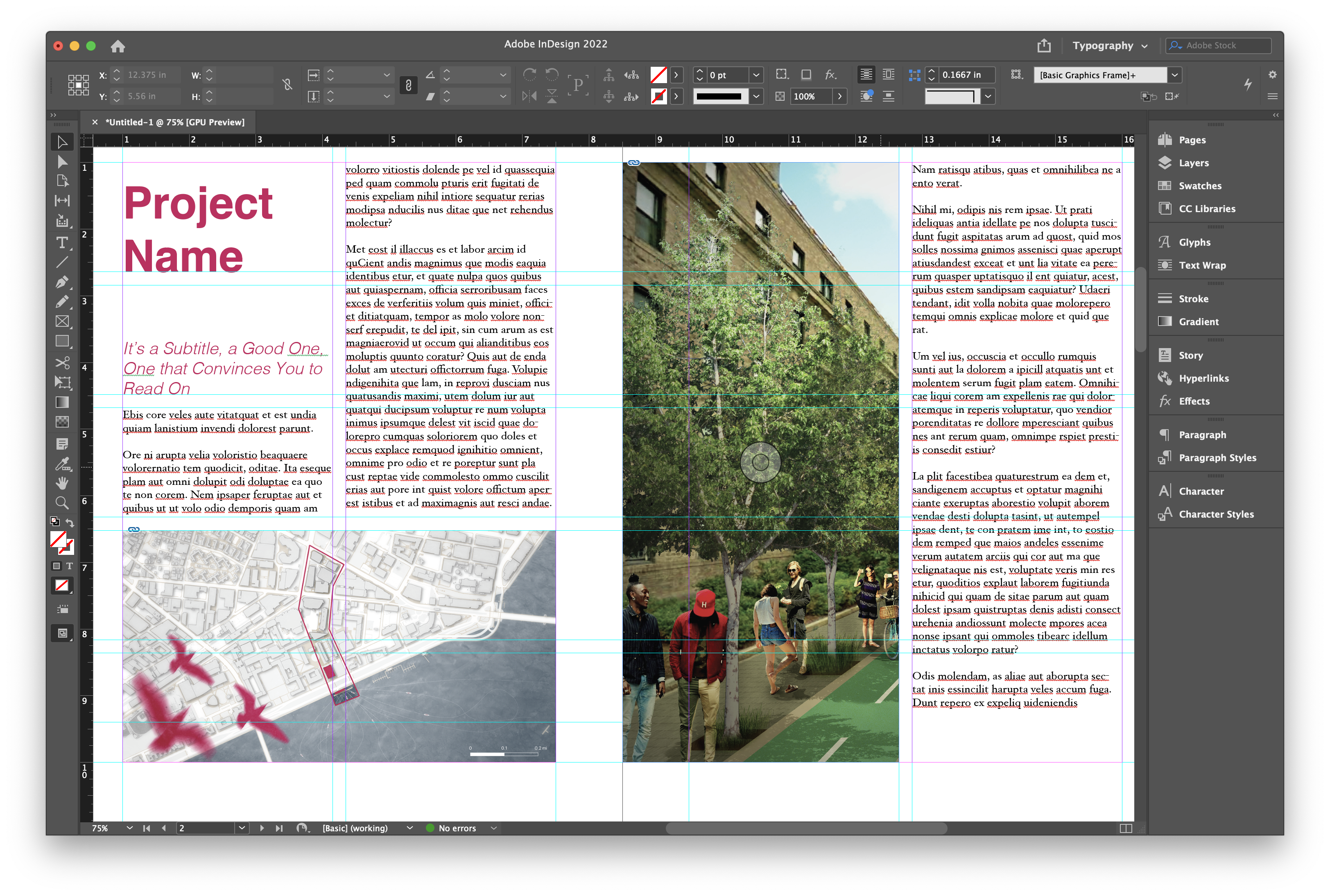
Position your images within the grid… noting that below, I actually broke my grid by bringing the image on the right all the way out to the left edge of the page. Breaking your margins and grid lines like this is one way to draw attention to a particular image, and playing with breaking the margin that’s on the inside will anchor the page in a way that’s quite nice. Playing with strategic breaks is one way to produce punchy documents!
Package
Similar to Illustrator and GIS, InDesign doesn’t embed images, it
saves the link to those images. This feature enables fast work on large
files. At the same time, it does necessitate packaging the file and all
its images in order to transfer from one computer to another. Navigate
to File > Package—this will save a folder with all
necessary media, fonts, etc. that you can transfer between team
members.