Analyzing Airbnb Listings with Excel

Yuan Lai, PhD (He/him)
- Lecturer in Urban Science and Planning
- yuanlai@mit.edu

Eric Robsky Huntley, PhD (They/them)
- Lecturer in Urban Science and Planning
- ehuntley@mit.edu
Tutorial Information
Methods
Tools
This workshop illustrates the basics of Excel, as well as a few intermediate techniques that you might encounter in the context of a GIS or data science project. As a tutorial and a case study, we investigate Airbnb listings in the Greater Boston Area.
Data Inspection
Data Dimensions: How Many Records?
As planners work with increasingly growing variety and volume of data, it is critical to know the typology and dimension of your dataset before any calculation, manipulation, or analysis. Generally, the datasets you work in Excel are structured as tabular data—in other words, data stored in columns (usually representing attributes) and rows (usually representing observations). Thus, the Dimension of the dataset equals…
Let’s open the file airbnb_units.xlsx. In Excel you can
simply select the columns (usually the first row) or the index (usually
the first column) to inspect the dimensions of the dataset. Select row 1
to check the total number of columns:
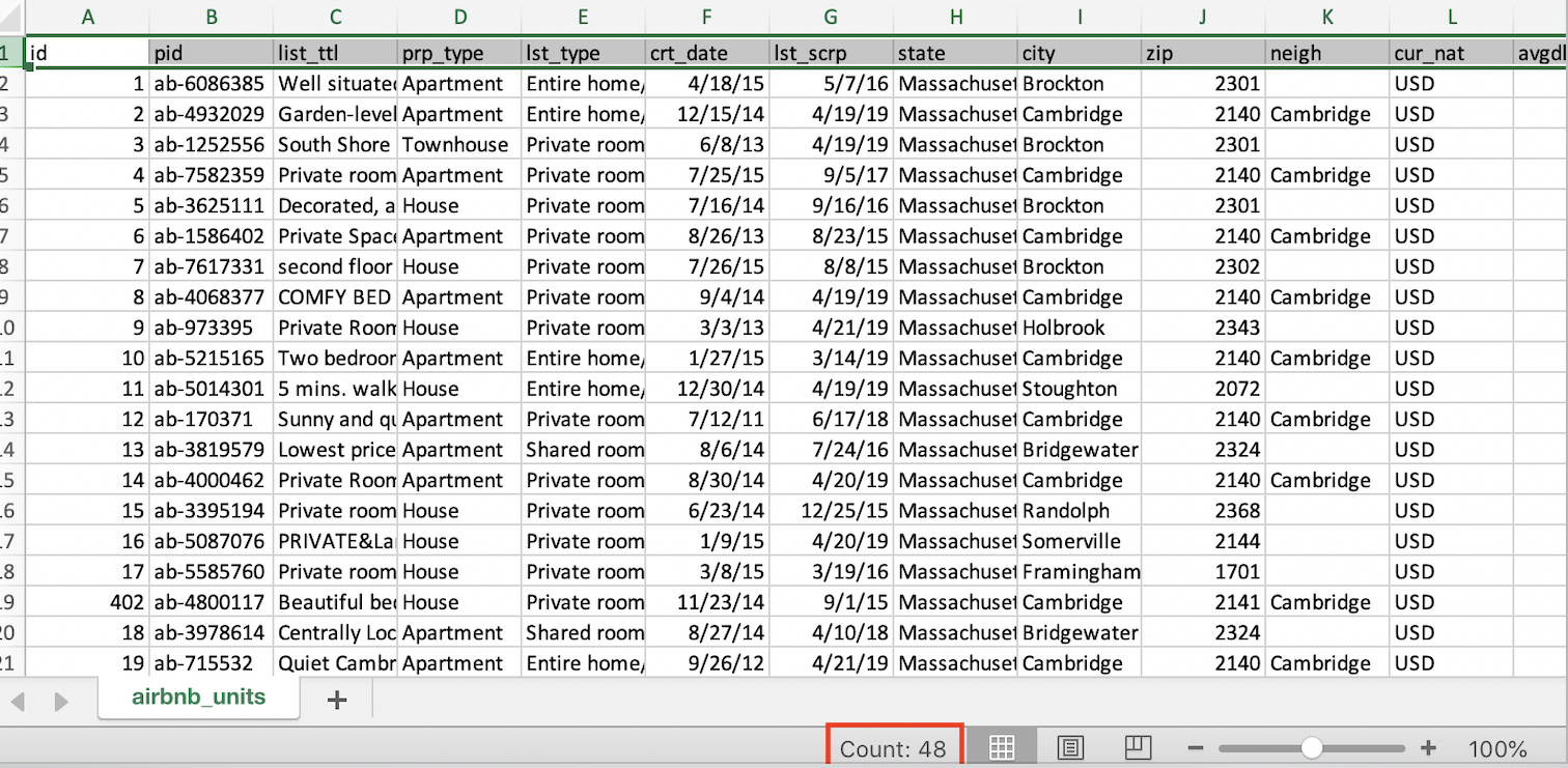
How about the rows? Select the column A (the first column) to see how many rows in total. Then select Column K to see if the count of rows keeps the same number. Why does Excel return a different number of rows for Column K? It turns out that Excel is counting values, not strictly rows and columns. This means that using this method you should be careful to select rows and columns that do not have any null observations (like an index column or the first row, which usually contains field names).
Metadata: Data About Data
Metadata means "data about data". It provides a high-level summary of one or a series of datasets, such as the author, means of the data generation, purpose of the data, data format, file size, data quality, and other necessary guidance/explanations for the users. In particular, structural metadata describes the structure of a dataset or database such as tables, columns, keys, and indexes.
Now open the Excel file metadata.xlsx. Is this
comprehensive metadata for airbnb_units.xlsx? What is the
possible reason for this discrepancy? Columns have been renamed here!
(And because they’re all 8 characters or under, we can assume this was
exported from a Shapefile, which caps column names at 8 characters.)
After checking with your colleague who processed this data, you now confirm the following column names and their meaning:
crt_date: The date the vacation rental listing was created.pid: Property id.rp_type: Types of accommodations.avgdly_u: Average daily rate in USD.annrev_u: Annual revenue in USD.occ_rate: Occupancy rate.- Occupancy Rate = Total Booked Days / (Total Booked Days + Total Available Days).
- The calculation only includes vacation rentals with at least one booked night.
bed: Number of bedrooms.max_gs: The maximum number of guests the vacation rental property can accommodate.canc_pol: Cancellation policy for the vacation rental listing.
Data Wrangling
Variable type and Cell Formatting
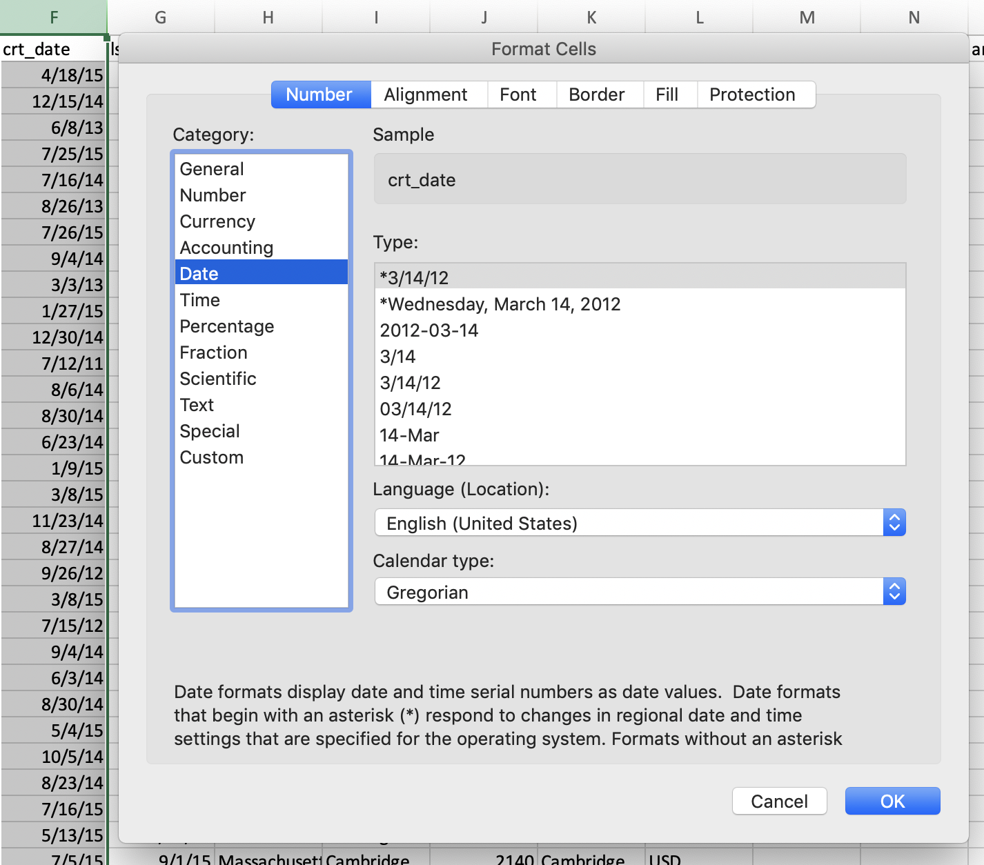
Data values in Excel can be stored as different types with related
methods for calculating. Look at crt_date, or the date the
vacation rental listing was created. It appears as a date—if you open up
the format pane (cmd-1 or ctrl-1 on Macs and
PCs, respectively) you can adjust how it is displayed.
Sort & Filter
The Sort & Filter tool enables you to…
- Sort rows by a column, ascending or descending;
- Create a subset of data based on one or multiple variables.
Create a filter for each column by selecting all columns and clicking
Data > Filter in the ribbon. Note that each column now
has a small triangle next to the name, indicating that you can click to
set up a filter using a helper screen. Set up a filter on the
city column such that the sheet only displays listings in
Cambridge and Boston. Check out the row index (i.e., the numbers on the
far left)—these are telling you that this is a subset! See how they
skip? That indicates that we’re excluding some rows from our view.
Finally, filter out cases where the average daily rate is 0 or missing (a greater than zero criterion will filter out rows with missing values as well).
Let’s create a new sheet, name it Cambridge and Boston.
Then copy and paste the following columns from the
airbnb_units sheet with associated conditions specified
below.
id,pid,prp_type,lst_type,city,avgdly_u,bed
Now check at the row number (a.k.a. index) on this new sheet—above, these indicated a subset. This is no longer the case! We’ve created a copy of the subset and placed it into a new table.
Basic Descriptive Statistics
Use functions AVG( ), MAX( ), and
MIN( ) to calculate some simple descriptive statistics:
- The maximum, minimum, and average daily rate: is the minimum rate realistic?
- The latest listing, and how many days it is from the first listing.
We can also use some slightly more sophisticated tools if we load Excel’s Analysis toolpack—click “Analysis tools” in the ribbon and check “Analysis ToolPak.”
Click Data > Data Analysis in the ribbon and set the
following parameters:
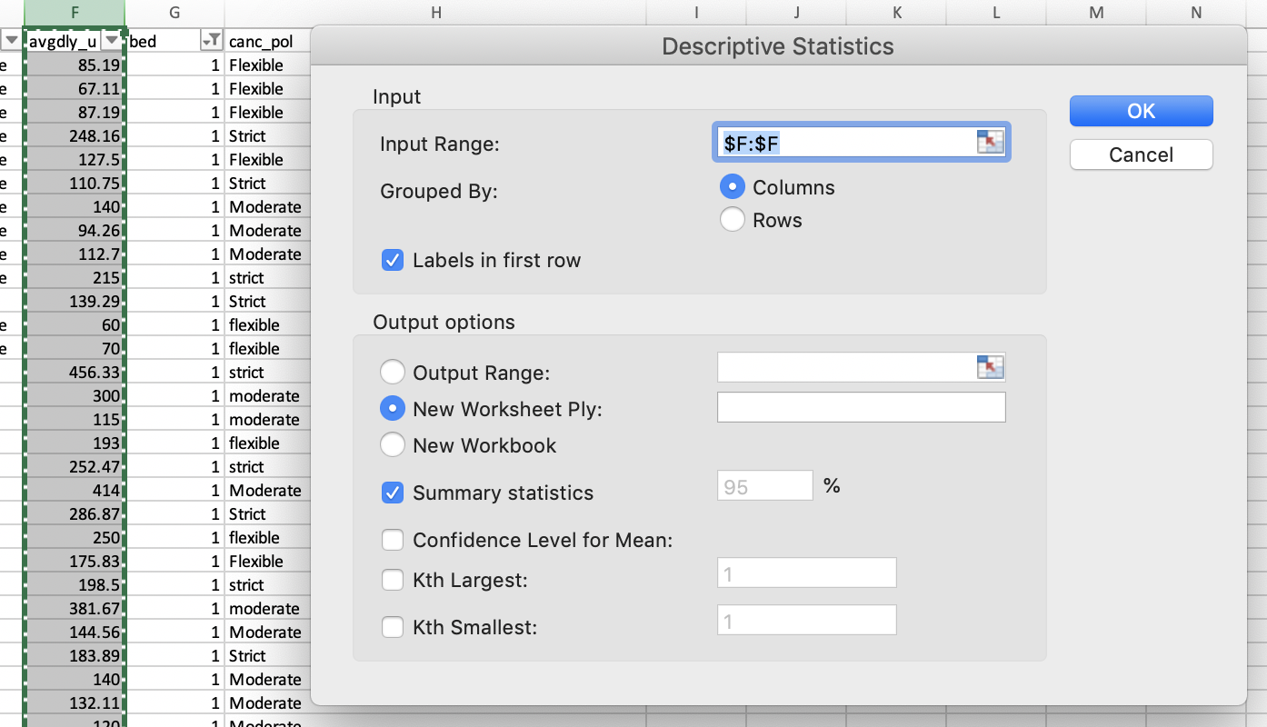
Running the tool, you’ll see the following results:
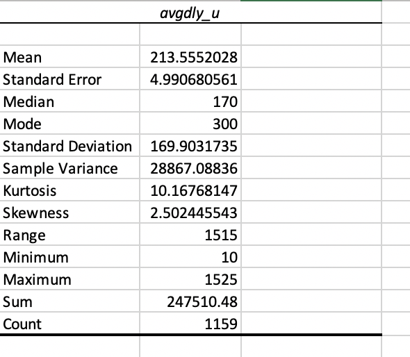
This is a quick way to get a sense of your data using common summary statistics! There may be a few you’re unfamiliar with—kurtosis and skewness, for example. These are measures of how long the tails are on your frequency distribution! (This data is very positively skewed—i.e., it has a long right tail.)
Pivot Table
You can use a Pivot Table to calculate, summarize, and analyze data to compare by groups and explore patterns.
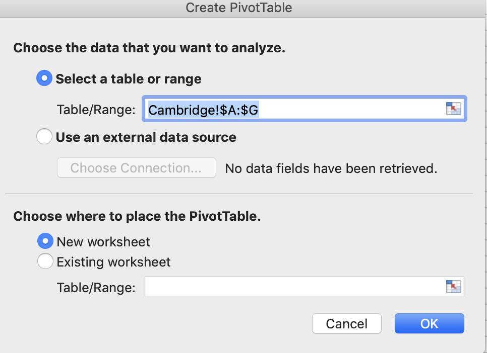
Let's create a pivot table on a new sheet named
Pivot_Table.
- Go to Insert--> Pivot Table
- Select all on the
Cambridge and Bostonsheet.
- Choose to place the PivotTable in a new worksheet.
Now click the table area, you will see a
PivotTable Fields pane. This is the interface for you to
choose what to calculate/report on your pivot table. From the
Field Name panel…
- Drag
bedto Columns; - Drag
cityto Rows; - Drag
avgdly_uto Values;
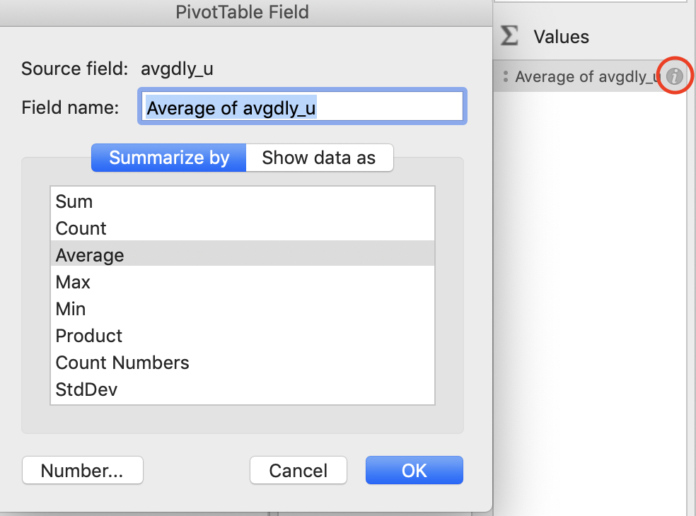
The newly generated column summarizes the sum of average daily rate by cities. This is not very informative—the average would be far more informative!
Click the small i icon next to the metrics calculated in
Values pane. Change from Sum to Average. You can also
change the filed name. Let’s call it
Average Rate ($/day)
Let’s work together to answer this question:
What are the average daily rates in Cambridge and Boston, grouped by the number of bedrooms (bedroom <= 3) and property type (apartment and house).
To answer this question, you’ll need to filter the pivot table. One of the quirks of pivot tables is that they don’t allow you to use a column as a filter and a row or column at the same time. (I KNOW, RIGHT?) But! You can filter first, then drag back into a row or column to see your changes reflected.
As such, move bed into the columns and remove all except
0, 1, 2, and 3 bedroom units. Then, move it back into your rows. Do the
same for prp_type, filtering for apartment and house.
city should be your column.
The resulting column compares daily rates for apartments and houses in Boston and Cambridge by bedroom count. Now, we’ll plot a figure!
Figure Plotting
Bar Plot with Pivot Chart
Let’s add a plot! Click on the pivot table, and from the ribbon,
select Insert > Pivot Chart. Excel will automatically
plot a bar chart of average daily rates, comparing Boston to
Cambridge—play with changing the Axis order! This will affect how bars
are grouped.
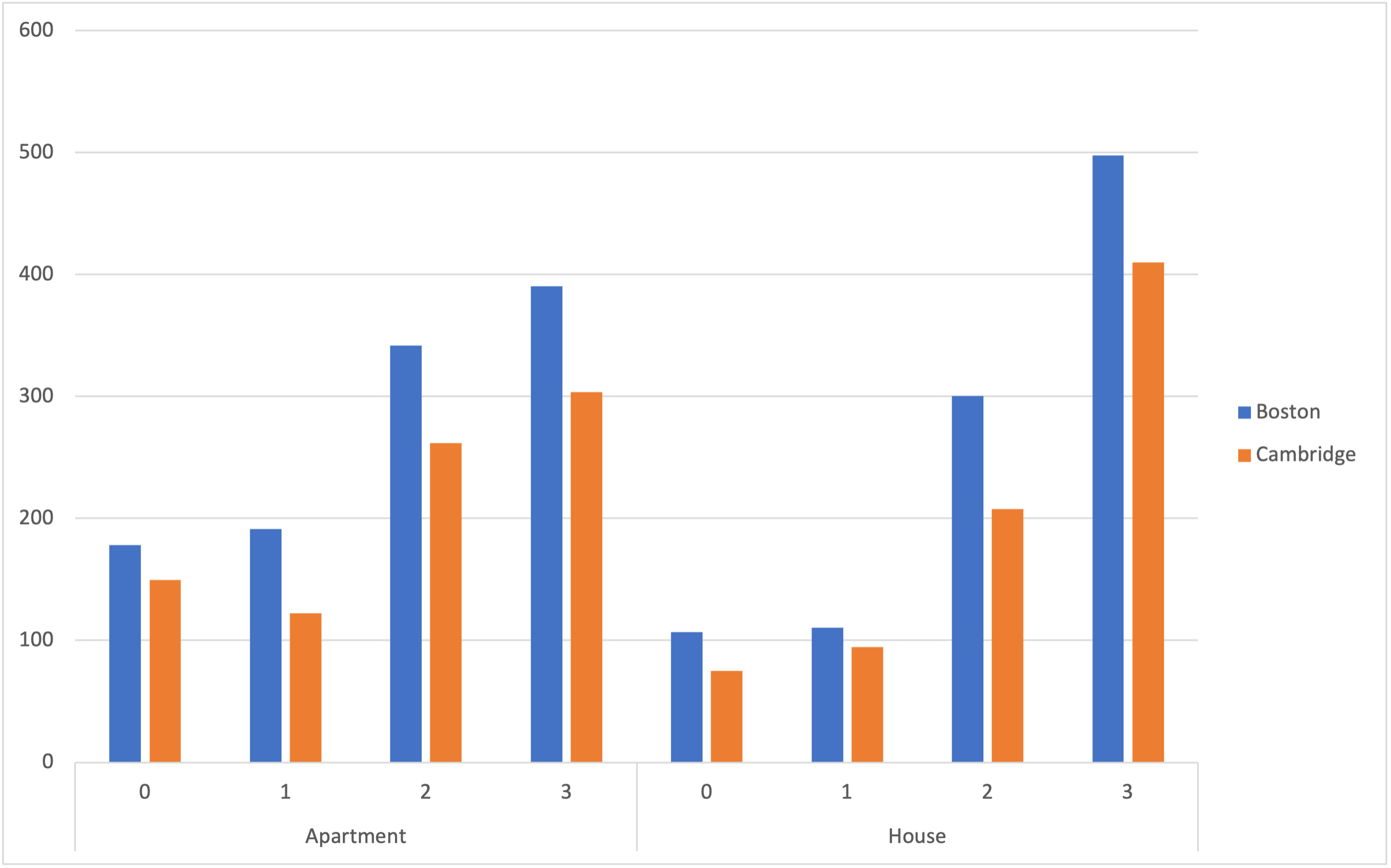
From here, play with your chart—under the ‘design’ tab, you can choose a range of different defaults. You can also add titles, change colors, and modify other attributes of your plot.
Box Plot
Of course, we may want to produce statistical plots as well—for example, box and whisker plots! These are a great way to measure the spread, or dispersion of the price for one-bedroom apartment listings between Boston and Cambridge.
Create a new sheet and copy your all rows that are in Boston or Cambridge, have 3 or fewer bedrooms, and that are apartments or houses. This should be familiar! Once you’ve created this new sheet…
- In the ribbon, choose Insert > Statistical > Box and Whisker > Select data
- Select the columns in order of: avgly_u > city
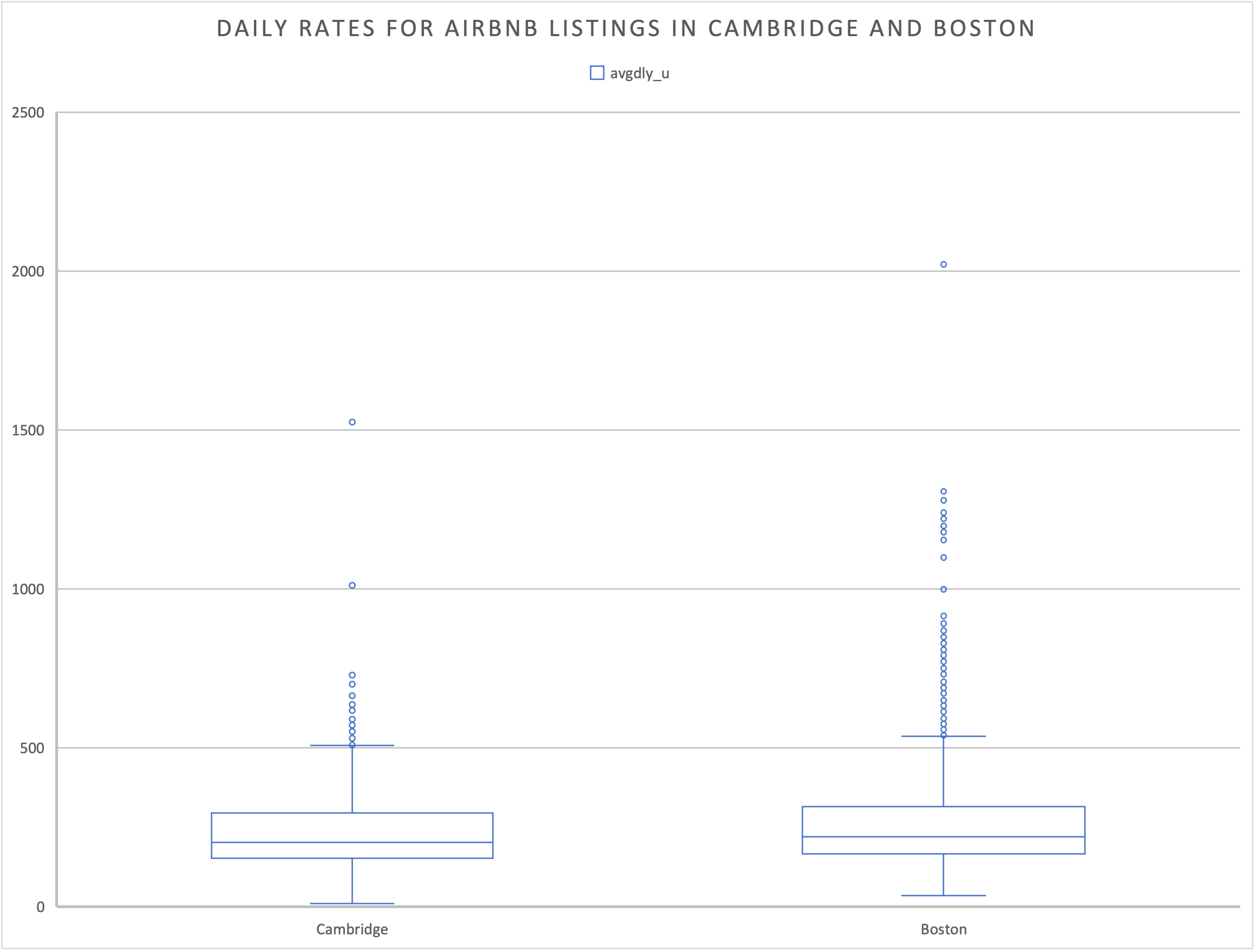
Amazing! You’ve produced a graphic to analyze the spread of listing prices for Airbnbs in Cambridge and Boston.
Final Takeaways
In this workshop, we go through the following key components of Excel:
- Data inspection and statistical summary
- Basic data manipulation using Pivot Tables and condition
- Basic data plotting and figure generation
Additional Resources
- Excel Statistics: A Quick Guide by Neil J. Salkind. SAGE.
- Master Excel for Data Science from LinkedIn Learning
- Introduction to Data Analysis using Excel (edX mini online course)